Supporting CHANGE with drawn storytelling
•Télécharger en tant que PPTX, PDF•
2 j'aime•3,148 vues

This is from a short talk and a mini workshop I've run for various people. The latest incarnation was for the Change Management Institute chapter in London, UK. Interested in the workshop/talk? Contact info(at)businessillustrator.com

Recommandé
Recommandé
Contenu connexe
Similaire à Supporting CHANGE with drawn storytelling
Similaire à Supporting CHANGE with drawn storytelling (20)
Plus de Business Illustrator Ltd
Plus de Business Illustrator Ltd (8)
Dernier
Dernier (20)
Supporting CHANGE with drawn storytelling
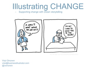
- 1. Illustrating CHANGE- Supporting change with drawn storytelling Virpi Oinonen virpi@businessillustrator.com @voinonen
- 2. My work: Internal change communication
- 3. I do Stuff like this: (supporting behaviour change)
- 4. And Stuff like this: (Event scribing - listening for the pain)
- 5. And Stuff like this: (Event scribing - listening for the pain)
- 6. How I ended up doing what I do I blame this guy
- 7. The problem: Change communication is Boring & alienating
- 10. How can drawn storytelling* help? * Comics, narrative infographics, animations…
- 12. Cartoons help deal with negative stuff...
- 13. want to engage people in change? Part 1 Start with the Pain Question : in your work is it ok to talk about the negative aspects of change ?
- 17. Dilbert: all about pain From Dilbert.com
- 18. Cartoons take the edge off from the pain and help people go from griping to ”Ok, let’s do this”
- 19. want to engage people in change? Part 2 Show that things are in a flux with a hand drawn feel
- 21. “perfection kills engagement”. . .
- 22. What you think you communicate with slick visuals = Professionalism, success... What else do you communicate…?
- 23. Google book example. . .
- 25. Cartoons make abstract concepts more understandable (if you can’t take a photo of it - use a visual metaphor!)
- 28. RSA ANIMATE
- 29. Make the message stick with (lo-fi) storytelling (story is “data glue”)
- 32. I use a Narrative approach:
- 33. …Is Linear …Reveals only one THING at a time (Consultants beware: This takes discipline!) …Has an obstacle (shock horror – you have to show something negative!) A story…
- 34. A story doesn’t have to be real!
- 42. “If you give people facts without a story, they will explain it within their existing belief system. The best way to promote a new or different belief is not with facts, but with a story”. - Dave gray Food for thought:
- 43. Exercise: Draw a Comic strip about A problem
- 45. Comic strip about A problem 1st Panel: we want. . . ( THE GOAL ) 2nd panel: BUT . . . ( The obstacle ) 3rd panel: end result. . . (How things suck because we can’t reach our goal)
- 46. We want…. But…. (obstacle) so….(the end result)
- 47. We want…. But…. (obstacle) so….(the end result)
- 48. Dilbert by Scott Adams We want…. But…. (obstacle) so….(the end result)
- 49. TOPICS : 1. We want to become agile! 2. We want to become more innovative! 3. We want to change our hiring practices to achieve diversity!
- 50. Tip: FACIAL EXPRESSIONS matter a great deal
- 52. TOPICS : 1. We want to become agile! 2. We want to become more innovative! 3. We want to change our hiring practices to achieve diversity! 1st Panel: we want. . . ( THE GOAL ) 2nd panel: BUT . . . ( The obstacle ) 3rd panel: end result. . . (How things suck because we can’t reac our goal)
- 53. How did you find it?
- 54. How can all this help in Change management? -Reveal culture / process blockers (surveys are gold mines for culture blockers) -Model new behaviours : stories of people who are already doing things the new way (LONG SHELF LIFE! can later form parts of an employee handbook) -Explain the why behind change -as a Workshop tool Any Questions?
- 55. Get in touch: virpi@businessillustrator.com @voinonen subscribe to my newsletter: businessillustrator.com/newsletter
Notes de l'éditeur
- -Boring interesting -Artefacts -What I’ve learnt + exercise
- -STRATEGY / WHY OF CHANGE -NEW: CULTURE CHANGE (EMPLOYEE ANGLE) -WHEN ATTENTION IS SCARCE Change programmes, digital transformation but also senior management retreats.
- ANIMATION: BEHAV CHANGE DIGITAL WORKPLACE ADOPTION Client project: Digital workplace adoption Client wanted employees to adopt lots of new behaviours - We distilled the message into one key behaviour change: switching from sending attachments to sending links
- -EXEC MEETINGS / MAKING SENSE OF DISCUSSIONS Internal and external event – again on the lookout for problems…
- -EXEC MEETINGS / MAKING SENSE OF DISCUSSIONS Internal and external event – again on the lookout for problems…
- TWO TYPES OF COMMS PPL: Traditional and digital I was given two days to develop digital website and content for the campaign.
- EMPLOYEES’ ANGLE MISSING Q: ANYONE WORK WITH COMMS? NOT RELEVANT TO THE EMPLOYEE where are the employee stories? Where are the conversations?!? Question: does anyone work with communications? He (ruimin) shared a book with me that Haier employees had created, which brings the Haier culture to life through cartoons and quotes by a variety of employees. This book, simply called “Haier’s Pictures and Words,” was exclusively created by Chinese employees, but the concept is now spreading to other countries. Here are a few of my favorite quotes in it: “Corporate culture is like a pot of strong tea, the more you taste it, the better it tastes, and the aftertaste lingers.” By Wang Yong “The nature of innovation is to be creative in breaking something.” By Xiao Huang “Brand is upheld by user’s heart.” By Huang Fei “If you do not care about the users, the users do not care about you.” By Yang Honghui https://www.forbes.com/sites/jimstengel/2012/11/13/wisdom-from-the-oracle-of-qingdao/#7bd69a06624f
- INTERNAL COMMUNICATION IS 1) Too corporate 2) Too top down 3) Too positive (pain is not acknowledged) Ppl PAINT A VISION BUT NEVER ACKNOWLEDGE THE PAIN… Rank and file always get the sanitised mass communication – senior management can communicate with comics My background is in campaign communication: we know we can’t take people’s attention for granted, we have to listen closely what works and what doesn’t. IC have an old school top down comms approach “I’ve posted this message – so I’ve communicated” Internal communication is boring as hell Visual brand guidelines - no story -only brand approved imagery (images are strong communication tools) -I can do top level comms with cartoons but when it comes to rank and file you have to drop all humour, you can’t show problems and (No-one would share internal content in real life) Too positive
- DIAGRAMS NOT COMMS TOOLS Diagrams are awful communication tools…. But they are intellectually satisfying – you fit everytthing on one page... A lot of my work consists of unpacking diagrams
- With cartoons you can say negative stuff without it being threatening
- I WANT TO SHARE VS I HAVE TO SHARE
- If you don’t acknowledge pain you will face a lot of resistance – only by acknowledging it can you build trust and get people on your side to actually change things. It’s a crucial first step that you ignore at your peril! Cartoons Case medical cartoons.. In organisational context can defuse the negativity a bit.
- ARE YOU REALLY LOOKING TO ENGAGE? NOT JUST TALK AT PPL? -PAIN ALWAYS PRESENT IN CHANGE -CARTOONS / DRAWN STORYTELLING: LESS THREATENING HUMOUR HELPS Are you serious about engagement? Great for communicating pain points! with cartoons you can make negative stuff less threatening
- EMPLOYEES DEMONSTRATING NEW BEHAVIOURS (SOLVING A BIZ PROBLEM) Anecdotes = not same as stories
- Dilbert is all about pain DILBERT HAS SAID IT ALL – BUT ALSO CYNICAL BECAUSE NO SOLUTION, JUST THE PROBLEM
- When things are in a flux hand drawn line is better than slick, perfect line (the wobblier the better) With cartoons you can say negative stuff without it being threatening
- When things are in a flux hand drawn line is better than slick, perfect line (the wobblier the better) With cartoons you can say negative stuff without it being threatening
- AWE! INSPIRING VIDEOS BUT… PASSIVE CONSUMER MODE Slickness that inspires (for about a minute) but no lasting effect Inspiring videos – fine if you just want to inspire but not fine if you want to engage people IN ACTION! If you want them to contribute ideas
- BEST WAY TO ENSURE MESSAGE DOESN’T ENGAGE PPL – USE A STOCK PHOTO You can also have slick that doesn’t inspire – some visuals just help switch people off
- IT HAS BEEN DECIDED – TICK BOX THE SLICKER THE MORE PASSIVE What you think you communicate with slick photos: professionalism, success etc. What you accidentally communicate: -YOU HAVE NO SAY (things have been decided and this consultation etc is a tick box exercise) so people switch off -The more expensive looking the visuals the more likely people will think things have been decided and they won’t have to engage with anything With cartoons you can say negative stuff without it being threatening
- Hand drawn visuals make things more approachable and humble…. Inject some humility From How Google Works by Eric Schmidt
- HUMILITY – I DON’T KNOW YOUR CONTRIBUTION WELCOME Hand drawn visuals communicate HUMILITY, “I DON’T KNOW EVERYTHING” – I’m OPENT TO YOUR SUGGESTIONS make things more approachable, invite you to participate and have a say
- UNIQUE BENEFIT OF DRAWINGS With cartoons you can say negative stuff without it being threatening
- Bullet points are not memorable – a story acts as a GLUE It’s easier to produce a drawn story than a slick video story LOW FI VISUAL STORYTELLING is easy to produce Don’t overwhelm people! Breaking things into bits, linearity!
- Diagrams suck as a communication tool – the mental satisfaction of having everything in one PPT presentation, diagram or other coherent and comprehensive piece of communication. Diagrams are THINKING TOOLS, not communication tools STORYTELLING requires a different approach
- The problem: no story to follow, reveals too much at the same time. This was produced after the event. They could have turned it into something easier to follow.
- The idea is to reveal things bit by bit: VERTICAL works PPT works
- A story has a beginning – a middle and an end Revealing one bit at at time keeps people hooked Official communication have a problem with the obstacle bit…
- Story does not have to be real! You can construct it.
- An employee perspective
- DO NOT UNDERESTIMATE THE POWER OF STORYTELLING
- Draw a cat Draw a cat as CEO Draw a cat CEO in love
- We focus on how things suck (usually there is a happy ending in story exercises – but I want you to really explore the impact of a problem). This also explains the WHY AND helps make culture visible…
- ALSO: he actually crowdsources ideas to his audience And: notice that the problems Dilbert addresses are pretty hard core Dilbert is interesting because the artist is actually not an artist but a business person/engineer who uses his insights of the corporate world: mediocre engineer, mediocre business man and a mediocre cartoonist: but interesting is the VENN diagram of skills and knowledge that overlap.
- We focus on how things suck (usually there is a happy ending in story exercises – but I want you to really explore the impact of a problem). This also explains the WHY
- With drawings it’s easy to exaggerate
- We focus on how things suck (usually there is a happy ending in story exercises – but I want you to really explore the impact of a problem). This also explains the WHY
- SHOULD REVEAL THE “WHY” OF CHANGE – the starting point of any epic quest.
- PROBLEM WITH CURRENT WORKSHOPS (post-it notes, improv etc) NOTHING SHAREABLE HAIER Zhang Ruimin: employee handbook as crowdsourced comics BENEFITS -deal with negativity -shareable content -fun What is produced is hard to share. It’s dull. There are countless reports that gather virtual dust in a shared folder somewhere. What’s the point? Post-it notes and writing only engage part of the brain. CULTURE increasingly important: “culture eats strategy for breakfast) workshops as tools for - solving problems - getting everyone (literally) on the same page before a big project or initiative - a way to get people to share good stories/solutions and help them spread wider inside a company (maybe turn into a booklet) - as a culture mapping exercise (when there are a lot of unspoken rules, maybe threatening ideas - soften them a bit) - as an exercise to list behaviours/ways of thinking that are not desirable, as well as list the desired behaviours