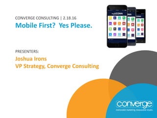
Mobile First? Yes, Please
•Télécharger en tant que PPTX, PDF•
0 j'aime•343 vues

Join Josh Irons, VP of Strategy for this free one-hour webinar about why is it important to prioritize mobile web design.

Recommandé
Recommandé
Contenu connexe
Tendances
Tendances (19)
En vedette
En vedette (20)
Similaire à Mobile First? Yes, Please
Similaire à Mobile First? Yes, Please (20)
Plus de Converge Consulting
Plus de Converge Consulting (20)
Dernier
Dernier (6)
Mobile First? Yes, Please
- 1. PRESENTERS: Joshua Irons VP Strategy, Converge Consulting Mobile First? Yes Please. CONVERGE CONSULTING | 2.18.16
- 2. JOSH IRONS VP STRATEGY & DEVELOPMENT
- 4. AGENDA • Mobile First Overview • Mobile Demographics What does this mean for your audience? • This Makes a Good Mobile Site • Increase Conversions • Things to Think About • Mobile Predictions
- 5. AGENDA 2015 Inbound Marketing in Higher Education Survey • Methodology • Results • Trends 2016 Predictions in Three Key Areas: • Digital Advertising • Content Marketing • Measurement What is “Mobile First”
- 6. Mobile First Defined We need to entirely rethink our visitor experience and re-map a customer’s journey. “Mobile First” means that as an organization thinks about its digital communications it should consider the mobile experience and how its audience will interact with it from their many devices.
- 7. AGENDA 2015 Inbound Marketing in Higher Education Survey • Methodology • Results • Trends 2016 Predictions in Three Key Areas: • Digital Advertising • Content Marketing • Measurement Mobile Demographics
- 8. Demographics
- 9. Demographics
- 10. Demographics
- 11. Demographics
- 12. Demographics
- 13. AGENDA 2015 Inbound Marketing in Higher Education Survey • Methodology • Results • Trends 2016 Predictions in Three Key Areas: • Digital Advertising • Content Marketing • Measurement This Makes a Good Mobile Site
- 14. A Good Mobile Site Mobile users tend to be very goal-oriented. They expect to be able to get what they need from a mobile site easily, immediately, and on their own terms. Design with their context and needs in mind without sacrificing richness of content.
- 15. Best Practices
- 16. Best Practices
- 17. Best Practices
- 18. Best Practices
- 19. AGENDA 2015 Inbound Marketing in Higher Education Survey • Methodology • Results • Trends 2016 Predictions in Three Key Areas: • Digital Advertising • Content Marketing • Measurement Increase Conversions
- 20. Main Considerations • Homepage Look and Feel • Ease of Site Navigation • Site Search • Ease of Form Entry which Drives Conversions • Responsive Design
- 21. Homepage A mobile homepage should focus on driving users to the content they are looking for. • Calls-to-Action should be in your face! › Put this in the most prominent portion of the site – Not below the fold or through menu choices • Menus need to be as short as possible while still providing good navigation › Short menus with distinct categories helps with navigation • Hold off on the promotions › Replace them with CTA
- 22. Navigation Menus need to be as short as possible while still providing good navigation • Short menus with distinct categories helps with navigation • Make it easy to get back to the homepage › Utilize the logo in the upper left corner to navigate.
- 23. Search Search on mobile is very important. Users need to find what they are looking for in a hurry. • Make sure the search bar is front and center › Place it at the top of your homepage and use an open text field • Search results must be relevant
- 24. Forms If a user is trying to sign up for an email list, requesting more information, or signing up for an open house it has to be seamless for a user to fill in their information. • Does your automatically present a number pad? • Does your form advance through fields as you finish them? • Is the interface the most simple one possible? • Is there a visual calendar to select dates? • Are there error messages? • Is the form efficient?
- 26. AGENDA 2015 Inbound Marketing in Higher Education Survey • Methodology • Results • Trends 2016 Predictions in Three Key Areas: • Digital Advertising • Content Marketing • Measurement Things to Think About
- 27. Things to Think About • Search Results • google.com/webmasters/tools/mobile-friendly • Analytics & Conversion Tracking • Email • Testing • Do your mobile ads drive users to your mobile site?
- 28. AGENDA 2015 Inbound Marketing in Higher Education Survey • Methodology • Results • Trends 2016 Predictions in Three Key Areas: • Digital Advertising • Content Marketing • Measurement New & Next in Mobile
- 29. New & Next • Personal & Relevant Experiences – Advertising is going to get dialed in. The clutter will go away. Human behavior will be paired with data that is becoming available through phones and consumer provided information will allow for specific experiences. The experience will be completely relevant to the user. • Geo-targeting – Mobile campaigns will include multiple location data points including beacons and geo-fencing to target prospects at not just in the right locations, but also at the most opportune times. • Ad Blockers Can Drive Content Marketing – With bad user experience or no user experience with ads, content marketing can pick up the slack and drive prospects to CTAs on mobile.
Notes de l'éditeur
- As I mentioned Converge is a digital agency for higher education We specialize in website redesign, inbound marketing and digital advertising.
- In a March 2015 article 2015, HubSpot published an article highlighting the top 15 mobile sites. Let’s take a look at some of these sites home pages and see what they have in common.
- In March 2015 article 2015 HubSpot published an article highlighting the top 15 mobile sites
- In March 2015 article 2015 HubSpot published an article highlighting the top 15 mobile sites. Let’s take a look at some of these sites home pages and see what they have in common.
- In March 2015 article 2015 HubSpot published an article highlighting the top 15 mobile sites. Let’s take a look at some of these sites home pages and see what they have in common.
- A desktop homepage often serves as a welcome page, messaging center and promotional space all in one, but the mobile homepage should focus on connecting users to the content they’re looking for. In this section, we explore the principles for building a mobile homepage that gets users what they need, fast. KEEP CALLS-TO-ACTION FRONT AND CENTER 2 KEEP MENUS SHORT AND SWEET 4 DON’T LET PROMOTIONS STEAL THE SHOW An extensive menu might work well for your desktop site, but mobile users won’t have the patience to scroll through a long list of options to try and nd what they want. Consider how you can present the fewest menu items possible - for instance, a major department store re ned the product categories on its mobile site, presenting study participants with a shorter, more clearly-de ned list than on desktop.
- A desktop homepage often serves as a welcome page, messaging center and promotional space all in one, but the mobile homepage should focus on connecting users to the content they’re looking for. In this section, we explore the principles for building a mobile homepage that gets users what they need, fast. KEEP CALLS-TO-ACTION FRONT AND CENTER 2 KEEP MENUS SHORT AND SWEET 4 DON’T LET PROMOTIONS STEAL THE SHOW An extensive menu might work well for your desktop site, but mobile users won’t have the patience to scroll through a long list of options to try and nd what they want. Consider how you can present the fewest menu items possible - for instance, a major department store re ned the product categories on its mobile site, presenting study participants with a shorter, more clearly-de ned list than on desktop.
- Site search is vital for helping mobile users nd what they’re looking for in a hurry. This section o ers tips for maximizing the value of your site’s search. PRINCIPLES 5 MAKE SITE SEARCH VISIBLE 6 ENSURE SITE SEARCH RESULTS ARE RELEVANT 7 IMPLEMENT FILTERS TO IMPROVE SITE SEARCH USABILITY 8 GUIDE USERS TO BETTER SITE SEARCH RESULTS Participants didn’t bother to swipe through multiple pages of search results. Instead, they judged a site’s search based on the results it returned rst, so make sure your rst page of search results are the strongest. Make life easier for users on small screens with smart-search features like autocomplete and corrected misspellings. t results rst, and implement smart-search features like autocomplete and spelling corrections. For sites that serve diverse customer segments, it can be helpful to ask users a few questions before they search to ensure they get results from the most relevant content segment. For example, a large shoe retailer began its mobile searches by having participants select the gender and size of shoe they were looking for. Student or prospective student or alumni
- Site search is vital for helping mobile users nd what they’re looking for in a hurry. This section o ers tips for maximizing the value of your site’s search. PRINCIPLES 5 MAKE SITE SEARCH VISIBLE 6 ENSURE SITE SEARCH RESULTS ARE RELEVANT 7 IMPLEMENT FILTERS TO IMPROVE SITE SEARCH USABILITY 8 GUIDE USERS TO BETTER SITE SEARCH RESULTS Participants didn’t bother to swipe through multiple pages of search results. Instead, they judged a site’s search based on the results it returned rst, so make sure your rst page of search results are the strongest. Make life easier for users on small screens with smart-search features like autocomplete and corrected misspellings. t results rst, and implement smart-search features like autocomplete and spelling corrections. For sites that serve diverse customer segments, it can be helpful to ask users a few questions before they search to ensure they get results from the most relevant content segment. For example, a large shoe retailer began its mobile searches by having participants select the gender and size of shoe they were looking for. Student or prospective student or alumni
- Responsive design
- Questions?