The Art of the Start 2.0 Presentation Checklist
•
193 j'aime•78,876 vues

Learn some lessons from noted speaker and author Guy Kawasaki on how to create a fantastic presentation. From The Art of the Start 2.0
Recommandé

Recommandé
Contenu connexe
Tendances
Tendances (20)
Plus de Guy Kawasaki
Plus de Guy Kawasaki (20)
Dernier
Dernier (20)
The Art of the Start 2.0 Presentation Checklist
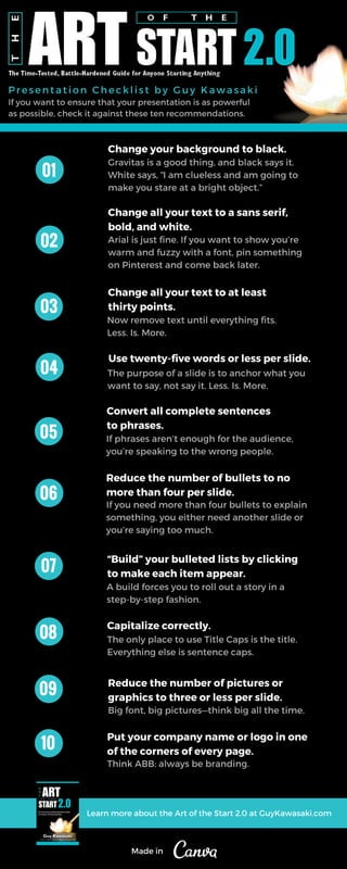
- 1. If you want to ensure that your presentation is as powerful as possible, check it against these ten recommendations. Presentation Checklist by Guy Kawasaki Change your background to black. Gravitas is a good thing, and black says it. White says, “I am clueless and am going to make you stare at a bright object.” Change all your text to a sans serif, bold, and white. Arial is just fine. If you want to show you’re warm and fuzzy with a font, pin something on Pinterest and come back later. Change all your text to at least thirty points. Now remove text until everything fits. Less. Is. More. Use twenty-five words or less per slide. The purpose of a slide is to anchor what you want to say, not say it. Less. Is. More. Convert all complete sentences to phrases. If phrases aren’t enough for the audience, you’re speaking to the wrong people. Reduce the number of bullets to no more than four per slide. If you need more than four bullets to explain something, you either need another slide or you’re saying too much. “Build” your bulleted lists by clicking to make each item appear. A build forces you to roll out a story in a step-by-step fashion. Capitalize correctly. The only place to use Title Caps is the title. Everything else is sentence caps. Reduce the number of pictures or graphics to three or less per slide. Big font, big pictures—think big all the time. Put your company name or logo in one of the corners of every page. Think ABB: always be branding. 01 02 03 04 05 06 07 08 09 10 Learn more about the Art of the Start 2.0 at GuyKawasaki.com Made in