Fordham -How effective decision-making is within the IT department - Analysis...
Question 4 as
1. Question 4: Who would be the audience for your media product?
The majority of the people who filled in my survey and questionnaire were mostly female
students that influenced the type of model that I wanted to use. Most females asked me
they’d prefer magazines such as Q and Billboard, which influenced me what type of colour
scheme that I wanted to use. Similar to these real magazines, I created mainstream and
‘well-known’ artists that gain many audiences. I thought that the ‘Q’ masthead was very
attractive which I used similar conventions to create my masthead creating a slight ‘italic v’
as the main selling point to keep this simple and easy to read.
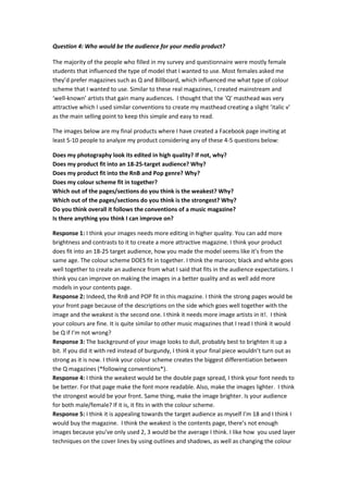
The images below are my final products where I have created a Facebook page inviting at
least 5-10 people to analyze my product considering any of these 4-5 questions below:
Does my photography look its edited in high quality? If not, why?
Does my product fit into an 18-25-target audience? Why?
Does my product fit into the RnB and Pop genre? Why?
Does my colour scheme fit in together?
Which out of the pages/sections do you think is the weakest? Why?
Which out of the pages/sections do you think is the strongest? Why?
Do you think overall it follows the conventions of a music magazine?
Is there anything you think I can improve on?
Response 1: I think your images needs more editing in higher quality. You can add more
brightness and contrasts to it to create a more attractive magazine. I think your product
does fit into an 18-25 target audience, how you made the model seems like it’s from the
same age. The colour scheme DOES fit in together. I think the maroon; black and white goes
well together to create an audience from what I said that fits in the audience expectations. I
think you can improve on making the images in a better quality and as well add more
models in your contents page.
Response 2: Indeed, the RnB and POP fit in this magazine. I think the strong pages would be
your front page because of the descriptions on the side which goes well together with the
image and the weakest is the second one. I think it needs more image artists in it!. I think
your colours are fine. It is quite similar to other music magazines that I read I think it would
be Q if I’m not wrong?
Response 3: The background of your image looks to dull, probably best to brighten it up a
bit. If you did it with red instead of burgundy, I think it your final piece wouldn’t turn out as
strong as it is now. I think your colour scheme creates the biggest differentiation between
the Q magazines (*following conventions*).
Response 4: I think the weakest would be the double page spread, I think your font needs to
be better. For that page make the font more readable. Also, make the images lighter. I think
the strongest would be your front. Same thing, make the image brighter. Is your audience
for both male/female? If it is, it fits in with the colour scheme.
Response 5: I think it is appealing towards the target audience as myself I’m 18 and I think I
would buy the magazine. I think the weakest is the contents page, there’s not enough
images because you’ve only used 2, 3 would be the average I think. I like how you used layer
techniques on the cover lines by using outlines and shadows, as well as changing the colour
2. of the cover line so it would be obvious for people to see. Overall, Just brighten up the
image or remove the background if you can.
Response 6: I think your photography is ok, but I think the model’s skin needs to be edited
to make the skin look brighter. I think your front cover is the strongest whereas the contents
page is the weakest; the image needs to be edited.
Response 7: The layout of your contents page is very strong and is appealing because you’ve
used many ‘features’ and other extra things to create verisimilitude in your music magazine.
Technically, you’ve followed the Q magazine from taking from its masthead and placing
them on the left hand side of the page. I think you just need to change the font of your
article in your double page spread.
Response 8: I think all your pages are all in high quality, sticking in the same colour scheme
and model, which makes this very professional from my POV. It does fit into the audience
although maybe to make this more attractive to the audience, you can change the sizes and
colours of the wordings of the pull quote to make this more informal.
Response 9: I think your magazine fits into a more pop rather than RnB because of the
singer you have used throughout the pages. The colour scheme does fit into audiences that
are both suitable for male and females. Just add more artist on the second page.
Response 10: Your photography is set in a high-quality, you probably used a professional
camera?. Fairly needs editing to make this more professional rather with images in a poor
quality, which may affect the whole magazine that you’ve created. Overall, it’s just the
image that needs editing/adding.
Summary
Majority of the people liked the content of my magazine of how this fits into the appropriate
audiences by making the model the similar age that allows the magazine to be readable for
them as well as how I have followed many conventions of a music magazine. The majority
wanted me to improve on mainly the images that I’ve used. They told me I could edit more
through Photoshop by setting up higher contrast and higher brightening up the image.
Screenshots