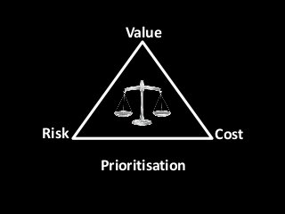
Learn Value Tail - Risk Value Cost - Prioritisation
•Télécharger en tant que PPTX, PDF•
1 j'aime•922 vues

What if you factor learn-value-tail concepts with a Risk-Value-Cost bubble chart? Hopefully an opportunity for people to collaborate easily with a simple non prescriptive format for understanding where their risks are. Possible extensions around colour coding features that result in a complete value stream uplift. Risk, Assumptions, Issues, Dependencies discussions around highest risk, highest cost factors. And all just because of some simple visualisation. (fingers crossed anyway) Note: I've also made available a excel spreadsheet that creates the bubble chart for you. https://www.dropbox.com/s/7eqqhi1rhnnafdf/Risk-Value-Cost.xlsx

Recommandé
Recommandé
Contenu connexe
Dernier
Dernier (20)
En vedette
En vedette (20)
Learn Value Tail - Risk Value Cost - Prioritisation
- 2. Learn – Value - Tail Knowledge Acquisition Curve - http://alistair.cockburn.us/
- 3. Mapping (Risk – Value – Cost) -2 0 2 4 6 8 10 12 -2 0 2 4 6 8 10 12 Risk Value Risk - Value - Cost PBI 1 PBI 2 PBI 3 PBI 4 PBI 5 PBI 6 PBI 7 PBI 8 PBI 9 PBI 10
- 4. What’s in the circle Learn Business Value Shine & Gloss
- 5. What’s in the circle Learn How Business Value Shine & Gloss Learn What Learn How Business Value Business Value Business Value Business Value Shine & Gloss Shine & Gloss Shine & Gloss
- 6. Separate Learning -2 0 2 4 6 8 10 12 -2 0 2 4 6 8 10 12 Risk Value Risk - Value - Cost PBI 1 PBI 2 PBI 3 PBI 4 PBI 5 PBI 6 PBI 7 PBI 8 PBI 9 PBI 10
- 7. Separate Learning – Learn in Small Pieces -2 0 2 4 6 8 10 12 -2 0 2 4 6 8 10 12 Risk Value Risk - Value - Cost PBI 1 PBI 2 PBI 3 PBI 4 PBI 5 PBI 6 PBI 7 PBI 8 PBI 9 PBI 10
- 8. Do as little as possible to move this down! -2 0 2 4 6 8 10 12 -2 0 2 4 6 8 10 12 Risk Value Risk - Value - Cost PBI 1 PBI 2 PBI 3 PBI 4 PBI 5 PBI 6 PBI 7 PBI 8 PBI 9 PBI 10
- 9. Then rinse and repeat -2 0 2 4 6 8 10 12 -2 0 2 4 6 8 10 12 Risk Value Risk - Value - Cost PBI 1 PBI 2 PBI 3 PBI 4 PBI 5 PBI 6 PBI 7 PBI 8 PBI 9 PBI 10