
Recommandé
Contenu connexe
Tendances
Tendances (20)
En vedette
En vedette (19)
Similaire à Evaluation Question 1 - Part 2.
Similaire à Evaluation Question 1 - Part 2. (20)
Plus de ToriScott
Plus de ToriScott (20)
Dernier
Dernier (20)
Evaluation Question 1 - Part 2.
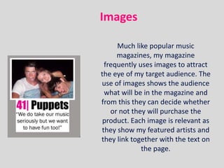
- 1. Images Much like popular music magazines, my magazine frequently uses images to attract the eye of my target audience. The use of images shows the audience what will be in the magazine and from this they can decide whether or not they will purchase the product. Each image is relevant as they show my featured artists and they link together with the text on the page.
- 2. Masthead Following usual media conventions, I have included a contents page masthead that uses the same text and colours of my front page, this makes the transition from the first to the second page seamless and flow well.
- 3. Editor’s note Another frequently used convention in music magazines is to incorporate an editor’s note. This feature allows the target audience to understand the thoughts of the person that has edited the magazine that they may be purchasing. It is also a technique that creates synthetic personalisation by befriending the reader without actually knowing them. The informal register used in the note will appeal to my target audience as it is easy and fun to read.
- 4. FeaturedImage My featured image (or studio shot) follows similar conventions to popular music magazines in the way that my subject is the largest item on the page, thus catching the eye of my target audience. The subject is leaning against the side of the page and looking rebellious in her pose; this will be an attractive photograph to my target audience as teenagers are stereotypically care-free and this will relate them to my image.
- 5. Articles The articles in a magazine show the reader exactly what is included in that particular issue, my magazine has developed this convention in the way that it includes a small section of text under the article heading that explains a bit more about that article. This, I feel, allows the target audience to have a better idea as to what they will be reading about.
- 6. Date and Issue number The date and issue number of my magazine has been placed in the top right corner of my contents page, I have done this as not to distract the potential reader’s attention away from the contents of the magazine however it is easy to locate if it is being looked for.
- 7. This is the double page spread of my music magazine.
- 8. Pull Quotes I have challenged typical media conventions with my pull quotes in the way that rather than incorporating a boarder and changing the font style, I have only changed the size and colour of the quote when compared with the rest of the article’s text. I have done this to create an easy flow when reading the article and feel that it has worked well as it still stands out as a pull quote.
- 9. Article The main article of my music magazine takes up one full page and part of the adjoining page, which is not an unusual convention of music magazines and this shows the reader that the article is important and worth reading, I think that this would appeal to my audience as they have a lot of interest in music and will enjoy to read about it.
- 10. Main Image The main image of my double page spread follows regular media conventions as it covers nearly a full page, this links to many of Q magazine’s articles as they use this convention also. The image shows my subject dressed up formally, which is stereotypical of celebrities thus making my magazine more believable. My subject is a youthful looking girl and this will appeal to my young audience as they can relate to this.
- 11. Headline The headline of my article is the largest piece of text on my double page spread, this is so that it is the first thing that my target audience will read and this will inform them as to what the article is about. It has been placed at the top of the page so that my potential readers will read this first. This is a typical convention of music magazines.
- 12. Tag Line The tag line of my article is the second largest piece of text on my double page spread, which is a normal occurrence of music magazine articles as it serves the purpose of making a transition between the large text to the small text so that the target audience will read them in the correct order. I think that my target audience will be attracted to this tag line as they are young and will appreciate the message and advice that it is giving.
- 13. Images My double page spread incorporates some other smaller images as well as the main image, I have done this in order to show my readers more about my featured artists. I have dressed my subject in outrageous clothing which will appeal to my target audience as young adults stereotypically dress in outrageous clothing therefore my readers will be able to relate to this photograph.
- 14. Thank You!