Presentation Design Tips - Pantone Best Colors To Use In 2017
•
8 j'aime•121,727 vues

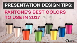
Pantone is the global standard for color, that’s why a Pantone color stays consistent regardless of what kind of design project you are working on, or where and how it’s being printed. Although most of next year's colors are muted, earthy tones, like Kale and Hazelnut, we also have vivid primary colours like Greenery, Lapis Blue and Primrose Yellow than can help convey essential ideas and capture attention at just the right moment in your documents. Here are some great examples of how you can combine these colors to create smart and beautiful presentations.