Top 4 navigation menu styles for websites
•
1 like•143 views

The web design and development industry is very dynamic in nature. So, in order to stay at the top, designers and developers have to align their practices with the latest happenings in the industry.

Recommended
Recommended
More Related Content
Recently uploaded
Recently uploaded (20)
Featured
Featured (20)
Top 4 navigation menu styles for websites
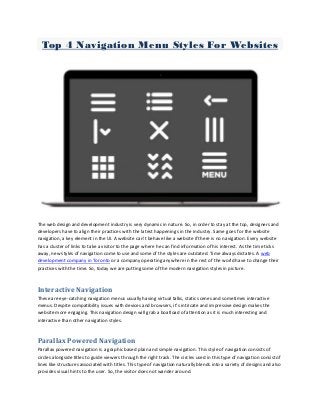
- 1. Top 4 Navigation Menu Styles For Websites The web design and development industry is very dynamic in nature. So, in order to stay at the top, designers and developers have to align their practices with the latest happenings in the industry. Same goes for the website navigation, a key element in the UI. A website can’t behave like a website if there is no navigation. Every website has a cluster of links to take a visitor to the page where he can find information of his interest. As the time ticks away, new styles of navigation come to use and some of the styles are outdated. Time always dictates. A web development company in Toronto or a company operating anywhere in the rest of the world have to change their practices with the time. So, today we are putting some of the modern navigation styles in picture. Interactive Navigation These are eye-catching navigation menus usually having virtual talks, static scenes and sometimes interactive menus. Despite compatibility issues with devices and browsers, it’s intricate and impressive design makes the website more engaging. This navigation design will grab a boatload of attention as it is much interesting and interactive than other navigation styles. Parallax Powered Navigation Parallax powered navigation is a graphic based plain and simple navigation. This style of navigation consists of circles alongside titles to guide viewers through the right track. The circles used in this type of navigation consist of lines like structures associated with titles. This type of navigation naturally blends into a variety of designs and also provides visual hints to the user. So, the visitor does not wander around.
- 2. Sidebar Static Navigation Sidebar static navigation menus are still not outdated. There are many blogs and online magazines utilizing these menus giving importance to a sleek and compact solution. Most of the websites use a static bright color panel placed either on left or right side to effectively display important links. The other side is used for scrolling up and down. The menu stays at its place while a visitor scrolls a web page up or down. Numerous links can be made easily accessible using this style of navigation. Hamburger Menu Some people say that hamburger menus are bad and while some say that these are good. Those who are against highlight four problems linked with this navigation – lower discoverability, less efficient, not glanceable and it clashes with platform navigation patterns. Those who are in favor say that it brings all links to one place. This is a dynamic, stylish and mobile-friendly menu that quickly grabs the attention of the visitor. If you want to choose the right navigation for your website being developed by a leading web development company in Toronto, let the developers make this choice. They know it better which navigation will be best for you website.