Stlux 2019 schmidt v5
•Télécharger en tant que PPTX, PDF•
0 j'aime•39 vues

Presentation at the STLX 2019 Conference on "The Power of Bad Design". Why shun bad design when you should be embracing it? Example are given from the Bad Design Taxonomy showing how to harness the power of bad design.

Recommandé
Recommandé
Contenu connexe
Similaire à Stlux 2019 schmidt v5
Similaire à Stlux 2019 schmidt v5 (20)
Dernier
Dernier (20)
Stlux 2019 schmidt v5
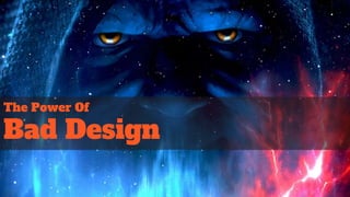
- 1. The Power Of Bad Design
- 7. Less Thinking “Less Thinking Usability is all about making things easier to use. Less thinking, less frustration. A website should do all the work and present visitors only with the things they’re looking for.” (Smashing Magazine)
- 8. Don’t Make Me Think Steve Krug’s “Usability Laws” 1. Don’t Make Me Think 2. It doesn’t matter how many times I have to click, as long as each choice is a mindless, unambiguous choice 3. Get rid of half of the words on each page, then get rid of half of what’s left.
- 10. Impact On User Taskflow
- 11. Design Taxonomy Matrix HelpfulUnhelpful Towards Away Invisible Design White Hat Design Actual Bad DesignDark Patterns UserExperience Goal Orientation
- 12. Invisible Design
- 13. Invisible Design
- 17. Bad Design
- 21. Why We Have A Job
- 22. Lawsuits Waiting To Happen
- 23. User Inyerface
- 24. Dark Patterns
- 29. White Hat
- 30. Pop Up Messages
- 31. Italics
- 32. Make Me Think: Fitt’s Law
- 33. Fitts Law/ Make Me Think
- 34. Make Me Think: Fitt’s Law
- 35. White Hat: Gamification & Engagement
- 38. White Hat: Gamification & Engagement
- 41. More Thinking: Scenario Fulfillment
- 42. Accessibility Extra Credit: Exit Diversion
- 43. Accessibility Extra Credit: Gerry Chair
- 45. Gray Hat: CVT Transmissions
- 46. Gray Hat: A&W ⅓ Pound Burger
- 47. Rationale: The Hard Maths More than half of the participants in the … focus groups questioned the price of our burger. "Why," they asked, "should we pay the same amount for a third of a pound of meat as we do for a quarter-pound of meat at McDonald's? You're overcharging us." Honestly. People thought a third of a pound was less than a quarter of a pound. After all, three is less than four!
- 48. Gray Hat - Comfort Noise
- 49. Gray Hat: Slow Down There Partner
- 50. Conclusion
- 51. The Rules Are Good
- 52. When To Use White Hat Design ● Automation Complacency ● Learned Carelessness ● Users are going too fast ● Users are doing something unsafe ● Your users are ignoring you ● Increasing perceived value
- 53. Conclusion ● Is it really bad design? ● Think about context of rules
Notes de l'éditeur
- Today I’m going to talk with you about the power of bad design. Everybody loves talking about bad design - there are scores of websites devoted to it.
- From school speed zones we need a copy of Microsoft Project and a slide rule understand...
- … to a button on a dryer indicating hot and cold. Can you tell which is which?
- How about a lengthy and complex note on your dashboard telling you not to take your eyes off the road?
- How about a map where the LAND is BLUE and the WATER is GREEN?
- What’s the worst that could happen? A gear shift knob next to the radio that looks like a volume knob.
- Bad designs like this are the reason we have UX guidelines. Such as this, from Smashing Magazine from a section entitled “Less Thinking”. Are we all behind this definition?
- How about the “usability laws” from Steve Krug? There is definitely a lot of not-thinking going on. That’s what led me to the topic of this talk. But let me back up and start from the beginning….
- It all started as I was walking down this road on my way to the train station. I was thinking about industrial design, as I know we all do on the way to work. I was thinking about one of these [Rocker Cover Safety Switch appears]. It’s called a Rocker Cover Safety Switch, and it’s used by pilots to make sure you don’t accidentally press a button - you probably recognize it more when it looks like this [Bank Of Switches appears]. It occured to me that these add an extra step in the user taskflow, but they are completely necessary. I wondered if there were more examples of things that helped you by hindering the user task flow.
- I began to search for examples out there where the user task flow was impeded: Example A: User task flow, one step back] Example B: User task flow with a barrier Example C: Extending the user task flow.
- I came up with a design taxonomy to help me categorize the different approaches to UX design. These are: Invisible design: Towards the goal, helps user (like Krug and Smashing Mag) Dark Patterns: Towards (a) goal, hinders user Actual Bad Design: Away from goal, unhelpful (like previous examples) White Hat: Away from goal, helps user. I really wanted to focus on the White Hat design. It was named after the white hat hackers, helping by finding voulnerabilities.
- This is the kind of design Krug and Smashing were talking about. It’s what you’re going to want to do 90% of the time.
- Like these switches and sockets with built in lights. Simple, effective, does not effect the taskflow.
- The most popular pattern out there is the vertical scrolling website. Invisible design builds on known patterns and templates to take advantage of existing user expectations.
- If Apple is using it, you know it’s understood by the masses.
- Amazon spends big bucks researching UX, and has a big influence on popularizing patterns, like these mega-menus.
- I know there are 200 people out there imagining drinking from this right now (and imagining all the ways you can spill wine on your shirt)
- We all know the actual Bad Designs, like this complex password screen that doesn’t give you feedback until after you press submit.
- Dealing with bad design feels just like this - having an argument with the technology.
- Bad designs are complex and don’t make use of an information hierarchy. It’s amazing, the Arngen site has been around for decades, proving that a bad design can still persist.
- How about this elevator button layout, or this screen on the right where the floor numbers are arranged ALPHABETICALLY.
- These product designs are just accidents waiting to happen.
- This is a gamified bad interface. User Inyerface is a game where you have to fight through the worst UX design ever conceived to get a good score. Take a deep breath if you’re going to try it.
- Just going to spend a couple of minutes on Dark Patterns, as most of us know what these are. Remember, we’re going towards a goal, but it’s not the users goal, so it’s unhelpful. That’s why these designs are in the bottom left quadrant of the taxonomy.
- We’re all familiar with this screen, where you try to download CC Cleaner, and you have three identical buttons that will download spamware.
- In this Yahoo screen, the big blue “No, Cancel” button actually keeps you subscribed - it cancels the cancellation. To actually unsubscribe, you have to click the more non-descript text below.
- The Gruen Transfer effect is probably one of the original Dark Patterns, invented before we even had websites. Invented by Victor Gruen, it describes an effect when users become overwhelmed and disoriented by the layout of a mall or store, making them more susceptible to purchasing. Gruen later renounced this practice as “manipulative”.
- Likewise, casino floors are designed without windows or clocks, and the slot machines use a particular scale of notes to create a carnival effect.
- Now, on to white hat UX design. Remember, now we are looking at features that hamper, inhibit, or cause the user to pause in the taskflow. I could not find any evidence of any literature, research, or education on this topic, so it was a difficult to find examples in the real world.
- First, an easy one. The pop up message is basically the rocker cover switch of the software world. “Are you sure you want to delete your hard drive?” It gives you one last chance before you do something stupid.
- Italics are an interesting example. Italics are a harder font to read, so the user is forced to read more slowly. Writers use this font for emphasis, forcing the reader to slow down and take in every word.
- Fitts law is used to describe the difficulty and/or time it takes to click a button based on the size of the target and the distance needed to click it. MT is the average time to complete the movement. a and b are constants that depend on the choice of input device and are usually determined empirically by regression analysis. ID is the index of difficulty. D is the distance from the starting point to the center of the target. W is the width of the target measured along the axis of motion. W can also be thought of as the allowed error tolerance in the final position, since the final point of the motion must fall within ±W⁄2 of the target's center.
- Example courtesy of Design Shack. Buttons on left side are close together, so there is a chance for pressing the wrong one. By taking advantage of Fitt’s law, we can make it harder to press the buttons by separating them. An example of white hat UX - helping the user by making it harder to press the wrong button.
- Still using Fitt’s law but taking advantage of the size aspect instead of distance. This is the shopping screen for Ebay. Notice the size of the buttons based on the importance and consequences. The smallest button removes the item from the list.
- Games are an interesting example of white hat design. The main goals of gamification are immersion and challenge, the latter being the opposite design philosophy of invisible design. The screen shot here is in fact taken from Trials Fusion, one of the Guardian’s 25 most difficult games to play ever. It’s so difficult that the success rate for levels is extremely low, but the feeling of gratification is high when completed. The worst game in the world would be an “invisibly designed” one where, say, you were always playing at the first, easiest level.
- Game developers play in to this aspect of their customers. Compare the starting screen for the easiest level of Wolfenstein (noting the description at the bottom of the page)...
- With the image for the most difficult level (again, noting the description at the bottom).
- You might not be the designer for a first-person shooter, but that doesn’t mean you can’t take advantage of your customer’s desire for challenge and engagement. Check out the gamification of Duolingo, making what can be the dry experience of learning a language as fun as possible. The goal section on the left reminds us of the Wolfenstein difficulty selection screen, and the badges accomplish the same sort of effect.
- Adding more complexity and density can actually help the user, as in the case of our Rick Astley image search.
- But wait, Bill, that last screen looks a lot like this one, which you told as was an example of a “Bad Design” screen. What’s the deal? It has to do with the matching of the task to the design. The image search screen used the incredibly fast processing power of the visual cortex to scan the images, probably in milliseconds. Adding in text, or even breaking chunking the images could actually slow the search down. In this case, the user is browsing, a task for which this is indeed a bad design.
- Here’s a case where “Don’t Make Me Think” got us in trouble. In 1988, when we were at war with Iran, the USS Vincennes shot down a commercial airliner, mistaking it for an attacking F-14. The official report cited “scenario fulfillment” as one of the causes of the disaster. The operators had drilled for an expected F-14 attack over and over to the point where the airliner caused them to go into that scenario mode. I was a UX person working on the AEGIS system much later, and even worked on the taskflow for a launch like this. These types of mistakes are first and foremost on the designers minds, and a great deal of thought and care was taken to make sure this was never repeated.
- One of the themes for this conference is Accessibility, so I thought I’d investigate how White Hat design played a role. I was also asked to think about ethics, and both of these themes play into this next example. This is a design called Exit Diversion. What you’re looking at is a Skilled Nursing Facility, where the doors are painted to look like bookcases. The goal here is to prevent dementia patients from either congregating near or trying to exit these doors. They are effective. But there are ethical issues around intentionally confusing your patients or making it difficult for them to find exits. Many facilities will not use exit diversion for this reason.
- Likewise, the Gerri Chair is designed to keep patients seated who have difficulty sitting up. However, the design of these chairs makes it extremely difficult to get out of, even for a fully mobile person. Once you put in the tray (as shown on the right), it becomes effectively impossible to leave the chair. White Hat - using design knowledge of ergonomics to prevent falls. However, many facilities use these chairs to “park” patients in front of a television and keep them from wandering. Many facilities refuse to use them as they consider them a form of “restraint”.
- The Gray hat designs actually make the products perform worse because of customer preference.
- The first example is the Continuously Variable Transmission (CVT), which uses ratios instead of discreet gears in cars. A computer selects the best ratios based on performance and gas savings. However, they lack the traditional gear shifting sound, which was disconcerting to users. Car manufacturers therefore added in ‘breakpoints’, which essentially negated the effects of the continuous gears.
- A&W wanted to introduce ⅓ pound burgers to their customers, but for some reason they did not do well in the market. So they decided to do some market testing to find out why...
- It turns out they had to pull the ⅓ pound burgers because the public was bad at math, thinking ⅓ pounds was actually less than ¼ pounds.
- Similarly, a slight background noise needed to be added to our phone lines which were capable of almost perfect silence. The reason? Customers felt uncomfortable with the complete silence, not knowing if the line was still live or not.
- Finally, the Coinstar coin counters you see at your local bank. They are actually capable of counting the coins nearly instantaneously. However, customers were less likely to trust the results of the instant count, so a time consuming, laborious process was added to make it look like the machine was counting every coin. Similarly, there have been computer programs where queries were returned too fast, causing the customer to doubt the reliability of the results. Adding in latency seemed to add ‘value’ to the results returned.
- Don’t throw the baby out with the bathwater. For most of your design considerations, the ‘invisible design’ philosophy will work. These examples were given to give you some design tools for things you might be stuck on, and need to think about differently.
- However, for the cases shown here, the answer might be found in thinking with your white hat on.