Good Email Design is Everywhere
•Télécharger en tant que PPTX, PDF•
1 j'aime•207 vues

This document provides an overview and summary of best practices for email design. It discusses the key elements of an email like the subject line, preheader, body, and call-to-action. It also covers different email design approaches like drag-and-drop vs coding in HTML. Examples are provided of before and after redesigns of newsletter and ecommerce email layouts. Favorite email templates from iContact and examples of emails from customers and other industries that are well designed are also highlighted. Emerging trends in email design and recommended resources are briefly mentioned at the end.

Recommandé
Recommandé
Contenu connexe
Similaire à Good Email Design is Everywhere
Similaire à Good Email Design is Everywhere (20)
Plus de iContact
Plus de iContact (20)
Dernier
Dernier (20)
Good Email Design is Everywhere
- 1. WELCOME © 2018 iContact LLC. All Rights Reserved.
- 2. BEFORE WE START AUDIO ISSUES? Let us know by typing a message into the question box. QUESTIONS? Questions will be addressed during Q&A in the order received. WANT THE RECORDING? We’ll send a link to your email address within 2-3 business days.
- 3. WELCOME © 2018 iContact LLC. All Rights Reserved.
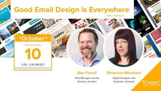
- 4. ALEC FERRELL YOUR PRESENTER Works on Marketing Team. Favorite Nic Cage is Charlie Bodell.
- 5. RHIANNON MERCHANT YOUR PRESENTER Works on Design Team. Favorite Nic Cage is Sailor Ripley.
- 6. WHAT MAKES AN EMAIL What is the framework of email
- 7. THE ANATOMY OF AN EMAIL WHAT MAKES AN EMAIL SUBJECT LINE PREHEADER BODY CALL-TO-ACTION FOOTER BRANDING
- 8. THE ANATOMY OF AN EMAIL WHAT MAKES AN EMAIL
- 9. THE PURPOSE OF EMAIL DESIGN BASICS From Name, Subject Line HyperTEXT Markup Language Pertinent brand information Pre-header teaser, body content An unsubscribe mechanism
- 10. HOW: DRAG AND DROP VS. HTML Drag and drop, HTML, Solid/Animated Images
- 11. THE INGREDIENTS OF EMAIL DESIGN OG-style HTML has come a long way Drag & Drop editors save time Coding helps you fine-tune A blend of both via modular framework Learn AS MUCH AS YOU CAN! “Modern HTML emails” by Jason Rodriguez BASICS DRAG & DROP VS. CODING IN HTML
- 12. EMAIL BEST PRACTICES Do it like this.
- 13. BEST PRACTICES Build a system K.I.S.S. Principle Alt text for blocked images When in doubt, start from scratch TAKEAWAYS
- 17. THEN THERE’S IMAGE BASED Looks great but not editable
- 18. IMAGE BASED EMAIL More design freedom not template-able Images must be enabled Demands designer on board Can be very beautiful TYPES OF EMAIL
- 19. DESIGNS BEFORE AND AFTER Email templates redesigned for higher optimization
- 20. NEWSLETTER LAYOUT BEFORE The design before is dated and cluttered. Navigation is not legible. Uses outdated Social icons. No focused branding. REDESIGN
- 21. NEWSLETTER LAYOUT AFTER Clearer Navigation Bold Call to Action More Modern Sectioning More White Space Stronger and more intentional images REDESIGN
- 22. ECOMMERCE LAYOUT BEFORE Overuse of white borders. Call to action does not stand out. Important information lost. Overstimulating. REDESIGN
- 23. ECOMMERCE LAYOUT AFTER Bolder sectioning Use of icons for important information. “Hero” image. Less is more. REDESIGN
- 24. iContact Themes Alec and Rhiannon’s favorites.
- 25. PERSONAL FAVORITE Allowing Imagery to shine. Bold complementary colors. Subtle Background Images Clear Sectioning iCONTACT THEMES
- 26. PERSONAL FAVORITE Accessible — nice contrast Great large images, tailor them to you Clear CTAs in mobile & desktop I get a sense of this brand w/o reading iCONTACT THEMES
- 27. CUSTOMER EMAILS WE LOVE Examples of our customer’s emails we think are great
- 28. BEAUTIFUL EMAIL BY RYK Great Use of background imagery Clear CTA Bold personalized headline Clear sectioning CUSTOMER EMAILS WE LOVE
- 29. BEAUTIFUL EMAIL BY BRIDGE PORT Branding is very strong Use of Illustration Clear CTA It looks nice! CUSTOMER EMAILS WE LOVE
- 30. iContact FEATURES Branding is very strong Telling recipients what they can do Clear CTAs — Learn More WORKS Responsive CUSTOMER EMAILS WE LOVE
- 31. EMAILS ALEC AND RHI LIKE Emails in our inbox we think are doing it right.
- 32. AN INDUSTRY FAVORITE - RHI Distinct and Unique Branding Use of Illustration/Personalization GIF that works as stand-alone Bold Headline and CTA EMAILS WE LOVE
- 33. AN INDUSTRY FAVORITE - ALEC EMAILS WE LOVE Modular template Bold colors with great “breathing” Admirable focus on copy Puns in every CTA
- 34. AN INDUSTRY FAVORITE - ALEC EMAILS WE LOVE STILL A Modular template Bold colors with great “breathing” Admirable focus on copy Puns in every CTA
- 35. THE FUTURE OF GOOD EMAIL Hold on to yer butts.
- 36. LITMUS LIVE IS SOMETHING YOU SHOULD GO TO! THE FUTURE OF EMAIL The human attention span is increasing! Background image support is improving! Typography and language encoding Faux Video which simulates playback Interactive galleries, carts, etc
- 38. OTHER SITES WE LOVE Reallygoodemails.com Litmus.com/scope paletton.com Tinypng.com INDUSTRY RESOURCES
- 39. Q&A © 2018 iContact LLC. All Rights Reserved.
- 40. THANK YOU © 2018 iContact LLC. All Rights Reserved.
Notes de l'éditeur
- Thanks so much Allie, and thanks to everyone who graciously chose to join Rhiannon and myself in this webinar as we discuss how Good Email Design is Everywhere: and we may draw some analogies and metaphors to email design in regards to both food and Nicholas Cage references. My name is Alec Ferrell, and I’m the Website Manager/Art/Creative Director & go-to email guy for the intrepid Marketing team here at iContact. I started working in email design and production first for Martha Stewart Living Omnimedia in the 2000s in New York City, and have built hundreds of unique emails since then for a variety of clients and campaigns through both strategic and tactical approaches to make them as “good” as possible. I’ve been at iContact for six-and-a-half years, first on the templates team for iContact from 2010 to 2012, and have served the marketing team’s design and production needs since 2014. I’ve worked with a ton of great email designers and marketers and and I’m thrilled to share this webinar with Rhiannon Merchant! Rhiannon, this is going to be a whole bunch of fun!
- Rhiannon - Hello, my name is Rhiannon I work on the design team. I’ve designed several of themes in our app such as Lovely, Home Sweet Home, and Corporate Strategies, I also designed all the layouts in the drag and drop editor and designed our help portal. My favorite character Nic Cage is Sailor Ripley from Wild at Heart because I’m Wild at Heart about email. ALEC - Yes, and Allie you were there The state of GOOD email is strong, and email marketing in general continues to be both rewarding and surprising as a means of effective HUMAN communication. Billions of emails are sent every day. So what makes even ONE of these a “good” design? We keep learning more and more — and GETTING more and more — so what we know and are receiving NOW is built on decades of testing and experimentation. Just like good food and Nicholas Cage, am I right Rhiannon?
- Here are the basics of what makes an email. We have our subject line, our preheader, the body of the email, a call to action, your footer, and your branding.
- No matter what email you get it’s basically this set up code. HTML stands for Hypertext Markup Language, which started as a way to store and send information. TABLES were commandeered by some crafty folks who decided that text or text and numbers just wasn’t enough to get their message across, and started slicing up and assigning images to areas to ROWS that were traditionally set for TABLE DATA. People got craftier and craftier and continues to build on this basic framework to this very day. Yes, emails are still built in tables. But there are some new approaches which may see tables be replaced with NEW MARKUP techniques, which I swear it seems are growing by the day. Whether this is all old news to you or you’ve never made an email before, by designing and handcoding OR through a Drag & Drop editor, this is basically what’s going on. There are infinite customizations and best practices which can be applied to this skeleton, meta information to help the browser or client interpret your message, various character encoding to deliver to multiple languages, webfont file references for advanced typography. Drag and Drop editors have much of this built in to your code which you may never see, but if you really want to look under the hood it will help you tweak your emails to BETTER DELIVER your GOOD EMAIL DESIGN to your subscribers.. To reiterate: every laptop, every desktop, every device, every email client ALL STILL BASICALLY USES THIS. Every HTML email you get is some version of that code or MARKUP that you see up there. It’s the DNA behind the anatomy of 99% of every HTML email.
- ALEC To paraphrase the late comedian Bill Hicks, “Your email isn’t special. Oh, I know YOU think it’s special, but it’s not special.” Even if you build the most garish email design in the world but it helps serve 50 of your 100 subscribers because it’s something THEY REALLY WANT, you’re actually pretty special. A 50% clickthru rate is not as rare as you think. Out of the gate, GOOD EMAIL DESIGN is and always will be based in giving the recipient something helpful that they really want. Like an unsubscribe button and easy path to opt-out. Rhiannon Let’s make sure your unsubscribe link is visible. You should make it easy for your recipients to unsubscribe. This helps build trust and also helps keeping you out of the SPAM folder. Remember, with email marketing your subscribers are in control of seeing your email marketing. One thing I liked at Litmus Live was that to remember to see your subscribers as people just not subscribers.
- SO, how can you build a GOOD email layout?
- Every HTML marketing email you receive is essentially made of the same ingredients — images and text, delivered in a table-based grid structure. Really exciting, right? So what makes an email GOOD?! Design is 50% what an email looks like and 50% how effectively it delivers the intended message to a willing recipient. That’s FORM + FUNCTION. FORM + FUNCTION is achieved through well-defined offers delivered in a package as accessible and actionable as possible. This could be just text, this could be all images, it could be animated and look like it’s on fire, it could look like a huge blob with “50% OFF” written in Comic Sans. The point is that if someone has opted in to your list, your FROM name and subject lines are compelling enough to have someone open your message, GOOD DESIGN could be GREAT DESIGN with a few solid best practices. Email, like Nicolas Cage, has evolved in many ways over the last 15 years. But at the core of both email marketing and Nic Cage, we have the same proposition: WHAT DOES IT LOOK LIKE AND WHAT IS IT SAYING? -If you don’t have any experience in coding HTML, it would be a great thing to have in your toolkit as an email marketer. -If you also have no design experience, it may benefit you to brush up on some basics of color contrast and typography. -Maybe we can get these into a future webinar or 101 handbook Whether you choose to work with HTML or drag and drop depends on your resources. HTML templates do give you more flexibility, but do you have the time and know-how to work in HTML? If you’re just a team of one and you need to quickly edit your templates, drag and drop may be a better option for you. You are more limited in drag and drop, but that doesn’t mean you can’t make your emails look good.
- ALEC We haven’t really said what GOOD EMAIL DESIGN actually IS yet, and I don’t think we’re ready to. First, you gotta know what it is you’re really looking to send. To do that, you’ll have to understand a little about rows and columns, just like a spreadsheet. Did I actually just say that? It’s a data table still, right? All the fancy emails you see that are super-designed within an inch of their lives are still just little boxes. Dare I say…CAGES? Nicholas Cages? Food?!? The above, incredibly dense and potentially confusing graphic above is from Jesse Blanner’s session “CREATING EFFICIENT WORKFLOWS WITH MODULAR DESIGN” at Meredith Corporation. What you’re looking at is a go-to modular system or library for all email templates their various clients and properties use, such as Time Inc email titles, as well as Martha Stewart. All you need to say right there. This system is called REUBEN, which Rhiannon you will remember is not an acronym for anything, but a full-on tribute to the Reuben Sandwich. Classic, modular, digestible (if prepared well, just like your email or your sandwich or your Nic Cage vehicle). Basically, any email that anyone needs can be built from a combination of any of the above elements. One-column (big image), three columns (products or offers, galleries, etc), even an eight column row (TR) for your footer links, or a pointlessly complicated animated gif array, like the Hamster Dance, the internet meme equivalent of a Nicholas Cage home movie. SERIOUSLY: if you plan ahead, you can set yourself up through either drag and drop or a modular boilerplate master template file from which you can build anything. From these ingredients, you’ll have a menu available to you and your recipients which will serve you as good an e-meal as you can cook up. Rhiannon? -- Rhiannon - Make your alt text good, just don’t say image, shoe, face. Make it interesting so people are enticed to enable those images. Make something like 50% off Nic Cage, I’d enable Nic Cage. Alec says I don’t know if we should enable Nic Cage, especially if he’s in Las Vegas. Or New Orleans for that matter. Or the Planet Earth.
- From that grid you can give people very simple or very complex layouts. The idea is not to be too disturbing. Be careful not over nesting tables in your email because you’re message can get lost. I’d rather see Nicolas Cage than Nicolas Cage in a Nicolas Cage Cage. Rhiannon- As funny as this visual is, I think it’s a good representation of complex coding emails can get when it comes to nesting your tables in order to achieve what looks like a simple design.
- Just like too complicated or too simple, which one is going to be more appetizing. The fundamental concept the same. Rhiannon – That big sandwich might look appetizing, but let’s be real it’s too much. Everyone loves a grilled cheese because it’s simple and delicious
- Or you can give them a salad. That’s up to you. Bottom line it’s food, it’s Nic Cage, it’s email. What makes good email for you. Rhiannon says – You want to cater your content and imagery to your audience. Be sure create in a way that connect with them.
- Rhiannon Another email type that is often used are the image-based or image only. I will admit, these emails can be very beautiful and you have more design freedom. You can do things like use whatever interesting fonts that you want, break the border with complex layouts, you can easily have text on top of images instead of background images. But, there are cons to using image based emails. One, there could be deliverbility issues, if someone doesn’t enable images they are not going to see your beautiful email, it is more expensive to maintain because it’s not as easily template-able and not as easily edited as a drag and drop or HTML template, they are also not as easily searchable in your inbox. Large companies can usually afford these risks because they’ve already established themselves and built trust. If you don’t have the resources to constantly redesign each and every email, this may not be the option for you. If they can’t view your email because they haven’t enabled images then they can’t take action on your email which defeats the purpose. ALEC Relatively free/inexpensive options to Adobe Creative Suite are available, like Canva. Do some research. Take an email you like and deconstruct it. Try to build it yourself. This isn’t like markup or complicated nested tables, but it could be. OR you could experiment, try out fonts and palettes and layouts in a program and see if you can recreate an email with the tools available to you. It’s like learning a song or any kind of other passion or skill. Just keep experimenting until you feel stronger with it. With both design and basic HTML chops under your belt, you can experiment with that much more.
- Rhiannon I mocked up some quote unquote “bad” emails based on real emails that I’ve seen and continue to see to give you an idea of what and what not to do.
- I split the email in half so you can view the whole email a little easier. I’m not going to sugarcoat it, but this template is out dated. This use to be a kind of standard layout for newsletter templates with the two columns, one being thin. Fruitcake use to be popular too, but I don’t think anyone wants that being brought over to their house anymore. The social icons are also outdated. This is a big no-no. You can see they are using an outdated twitter icon with the simple T. Also, please don’t use the twitter icon that has the bird with hair. These social media platforms do request that you use their most recent branding, so this isn’t just a personal pet-peeve. The navigation here is not very legible at all. There’s not a lot of clear branding here and some of the colors used are a bit random as you can see at the bottom button navigation. In those buttons, they are also using a font that’s not used anywhere else. Again, no clear branding. The call to action is just that plain blue linked text, which isn’t too inviting.
- I removed the date because people know when they’re getting your email, and replaced it with an issue number here in the preheader. I also added a much more clear navigation and got rid of some links that are not really needed, like home. Instead of having plain text as their call to action I’ve replaced them with large buttons that have a strong contrasting color. Ask Alec about the finger button width, Alec says something about Andre the Giant or Nic Cage in Ghost Rider Probably my favorite theme from litmus was accessibility. Not only is this a more optimized design but it’s beneficial to broader audience like those who have color-blindness, those who have aging or poor vision. Also, left-aligned text is much easier to read for those who have dyslexia. Between dyslexia, color-blindness, aging or poor vision that actually makes up for a good percentage of people. Having your email more legible definitely won’t hurt you. I’ve added accompanying images for the sub-articles, because people process images more quickly than text. This is a good example of using simple white space to show sectioning. It’s important for newsletter emails that you deliver your information in a way that’s easily digestible. Alec says something about how the email will responsive stack and look good on small devices.
- There’s too much distraction in this template. Some people go ham on the borders, so nothing really stands out and it all blends together. You have a great selling point here at the bottom “Free Delivery over $50 and easy returns” and it just gets lost, I see this often. This layout looks more like a web page. Remember, emails are for quick consumption where your website is where you want them to spend their time. This is about conversion. You might want to compartmentalize the email for a email campaign rather than just email. Alec says there is too much going on, it doesn’t look that bad but it’s just not working. National Treasure 2 analogy
- I wanted to keep the black because this is their branding but tone it down so it’s not so consuming. I added a full-width image, which we call a hero image, you want to use that as the main draw. You want to entice them enough to have them come back, don’t give them the whole menu. I added some personalization to the headline. At Litmus one big theme was that you want to connect to your subscribers emotionally. People are more likely to pick brands based on experiences or their feelings. That important information that was at the bottom, “Free Shipping over $50” now has its own banner right below the logo. Now people will associate this deal with your brand. This is also more of an industry standard. Study what others are doing and what hooks you in an email. The other information is here at the bottom with an icon. Again, people process images much more quickly than text. You want that selling point to stand out. I removed some unneeded navigation text and rest is here in a form of a button, let’s make it more interesting than just plain text. Alec says it’s great because you’re bring a clear CTA, it’s paired down well. He says it’s a great design (Rhi says thank you Alec) – If you see that the emails you’re creating follow a little in the before aspect you can see it’s just a couple of quick moves to make your email from servicable to good, maybe even GREAT!!!!!!!!
- This is personally my favorite theme I created. Maybe because I really love food, but I also think this is a good example of using strong contrasting colors to grab the viewer’s attention. In this one I use a background image in the body section, which is very subtle. This background image is also a seamless repeating image which is always a great option because it renders well. I like subtle background images because it still adds something special without taking away from the overall message. In a message like this you really want the food to be the star. Alec Says - Or if Nic Cage plays the star and the food at the same time. Can I ask you a question about bg images? How widely supported is it? That was not there 15 years ago. Yes, there still some emails clients that don’t support it, like Outlook. That’s why I like subtle ones that don’t’ make or break your email because when it fails, it fails gracefully. I’m glad you brought that up. This is a good example of knowing who you’re subscribers are. If no one uses Outlook it may not be an issue. If all your subscribers use gmail then you can be more aggressive with background images. Alec - Kind of like The Weather Man, it failed gracefully but the opening weekend was like a opening rate on a bad email
- I really like this Great Escape theme, this was created by Alexa in our product team. She’s really close to the drag and drop editor, and did a beautiful job of blending form and function. This is a versatile template for a product, service, portfolio, blog, what have you. A quick note about iContact’s theme engine: the theme refers to the feel, the character of the design approach, and from there you have several go-to layouts within these themes. If you’re using these, thanks for your patience, but it never hurts to reexamine the possibilities that a different layout can serve in your various unique campaigns. The different layouts can be adjusted to accommodate whatever message you need to send. The image is very direct and has a strong headline, maybe this is good for a newsletter or major product release or fundraising campaign. There are less image-heavy layouts in this and other themes that can put a travelogue or real estate business. There’s a clear logo, consistent palette, and evocative starter imagery that is hard to beat, I definitely want to know what’s happening with these types of images. I want to go there. Probably where we can’t get email, oddly enough. A good email design can sell you a ticket far away from wifi, so thanks Nicholas Cage! One question here, is the circular images. You can easily swap those out with your own images, or use online tools like Canva or even some crazy free upload sites that will crop a circular image for you. Watch out for background colors for transparent background images. But, in this, I get a sense of that this is a travel template. The images are allowed to shine. BUT REMEMBER: KEEP YOUR IMAGES SIZES AS SMALL AS YOU CAN! No dimensions like width or height, but below 200k. Lotta resources out there, but run your images through a compression tool like TinyPNG and you’ll be fine. The point there is getting the message to load well without tripping a SPAM filter.
- One thing I love most about this email is their use of background images. This is the kind of background image that if it doesn’t show in Outlook the email is still beautiful. You always want to be sure your fallback still works.
- I really like this email because there’s a purpose behind that’s not just trying to sell you something. The purpose behind this email is to rally people to a legislative session regarding the building of a new casino in Bridgeport, CT, to open the bidding process and have community involvement around a new enterprise which will impact thousands of jobs and hundreds of millions of dollars to one specific community. The CTA is about learning more about how to be involved. They’re not selling anything other than a way to rally people behind a cause. Text to image ratio (like signal to noise, there’s more signal there than noise) is great, clear call to action. Most of the info’s right there. This is successful. The ONLY thing that might be improved is the contrast and legibility, maybe a larger body font size. But I really like this one.
- Hey, how’d this get in here?! Well, I may as well talk about it. PHOTO EDITOR STOCK IMAGE INTEGRATION
- I love Headspace’s emails. Their branding is so unique and distinct. If you cover the header and footer, you know it’s their email. I’m a big fan of the use of illustration because it feel more personal. It’s a big trend now in design, and I don’t think it’s going anywhere any time soon. The GIF is just great. (To Alec) You can relate to this right? So there, we got empathy and personalization. Even better is that it still works really well as a stand-alone image in email clients where they won’t play the gif. That call to action is bold and bright. Alec- What happens when you have great animated email, and it won’t play your animation? (Rhi explains) Alec- keep it the first frame, don’t put the most exciting part outside the first frame.
- I love industrial music too, Skinny Puppy is my favorite. No Alec, Industry favorite. Modular, easy to digest, clear headers, one column for the most part.
- Modular, easy to digest, clear headers, one column for the most part.
- Here are some great sources that we use on the design, I believe you use some these as well, Alec. We wanted to share these with you guys hoping they can benefit you as well.