Typographic hierarchy and legibility research
•
2 j'aime•852 vues

A seminar that discusses Michael Twyman‘s notation system for establishing typographic hierarchy (headings and paragraph) and a summary of Herbert Spencer’s review of literature of over 100 years of legibility research. Useful for typographers to inform their design decisions.

Recommandé
Contenu connexe
Tendances
Tendances (20)
Similaire à Typographic hierarchy and legibility research
Similaire à Typographic hierarchy and legibility research (20)
Dernier
Dernier (20)
Typographic hierarchy and legibility research
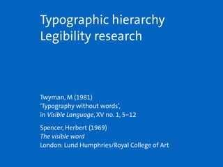
- 1. Twyman, M (1981) ‘Typography without words’, in Visible Language, XV no. 1, 5–12 Spencer, Herbert (1969) The visible word London: Lund Humphries/Royal College of Art Typographic hierarchy Legibility research
- 2. Twyman 1981 A notation system to guide discussion and design decisions Notation that describes function rather than exact form (making use of the technical limitations of a typewriter) Spatial grouping (Gestalt psychology): vertical and lateral spatial cues To show the typography is a modular system About the relationship between levels of heading and paragraphs of continuous text
- 3. Which examples would be ‘reasonably unambiguous in visual terms’? A xxxxxxxxxxxxxxxxxxxxx xxxxxxxxxxxxxxxxxxx ooooo xxxxxxxxxxxxxxxxxxxxx xxxxxxxxxxxxxxxxxxx ooooo xxxxxxxxxxxxxxxxxxxxx xxxxxxxxxxxxxxxxxxxxx xxxxxxxxxxxxxxxxxxxxx xxxxxxxxxxxxxxxxxxxxx D xxxxxxxxxxxxxxxxxxxxx xxxxxxxxxxxxxxxxxxx ooooo xxxxxxxxxxxxxxxxxxxxx xxxxxxxxxxxxxxxxxxx ooooo xxxxxxxxxxxxxxxxxxxxx xxxxxxxxxxxxxxxxxxxxx xxxxxxxxxxxxxxxxxxxxx xxxxxxxxxxxxxxxxxxxxx B xxxxxxxxxxxxxxxxxxxxx xxxxxxxxxxxxxxxxxxx ooooo xxxxxxxxxxxxxxxxxxxxx xxxxxxxxxxxxxxxxxxx ooooo xxxxxxxxxxxxxxxxxxxxx xxxxxxxxxxxxxxxxxxxxx xxxxxxxxxxxxxxxxxxxxx xxxxxxxxxxxxxxxxxxxxx E xxxxxxxxxxxxxxxxxxxxx xxxxxxxxxxxxxxxxxxx ooooo xxxxxxxxxxxxxxxxxxxxx xxxxxxxxxxxxxxxxxxx ooooo xxxxxxxxxxxxxxxxxxxxx xxxxxxxxxxxxxxxxxxxxx xxxxxxxxxxxxxxxxxxxxx xxxxxxxxxxxxxxxxxxxxx C xxxxxxxxxxxxxxxxxxxxx xxxxxxxxxxxxxxxxxxx ooooo xxxxxxxxxxxxxxxxxxxxx xxxxxxxxxxxxxxxxxxx oooo xxxxxxxxxxxxxxxxxxxxx ooo xxxxxxxxxxxxxxxxxxxxx xxxxxxxxxxxxxxxxxxxxx xxxxxxxxxxxxxxxxxxxxx xxxxxxxxxxxxxxxxxxxxx F xxxxxxxxxxxxxxxxxxxxx xxxxxxxxxxxxxxxxxxx oooo xxxxxxxxxxxxxxxxxxxxx ooo xxxxxxxxxxxxxxxxxxxxx xxxxxxxxxxxxxxxxxxx ooooo xxxxxxxxxxxxxxxxxxxxx xxxxxxxxxxxxxxxxxxxxx xxxxxxxxxxxxxxxxxxxxx xxxxxxxxxxxxxxxxxxxxx
- 4. Which examples would be ‘reasonably unambiguous in visual terms’? largest ethnic group in East Asia. Other languages also use variant forms of Hanzi: Kanji (Japanese), Hanja (Korean), and Chữ Nôm (Vietnamese). The Chinese language There are eight main varieties of speech in China thataredistinctlydifferentfromeachotherinterms of pronunciation and vocabulary, though they are often referred to as ‘dialects’ rather than languages. Linguistic aspects of Hanzi Chinese characters are classified as logographic, meaning that each character represents a mor- pheme, the smallest unit of meaning. It is often said that Chinese characters are pictographic; this is only partly true. largest ethnic group in East Asia. Other languages also use variant forms of Hanzi: Kanji (Japanese), Hanja (Korean), and Chữ Nôm (Vietnamese). The Chinese language There are eight main varieties of speech in China thataredistinctlydifferentfromeachotherinterms of pronunciation and vocabulary, though they are often referred to as ‘dialects’ rather than languages. Linguistic aspects of Hanzi Chinese characters are classified as logographic, meaning that each character represents a mor- pheme, the smallest unit of meaning. It is often said that Chinese characters are pictographic; this is only partly true. largest ethnic group in East Asia. Other languages also use variant forms of Hanzi: Kanji (Japanese), Hanja (Korean), and Chữ Nôm (Vietnamese). The Chinese language There are eight main varieties of speech in China thataredistinctlydifferentfromeachotherinterms of pronunciation and vocabulary, though they are often referred to as ‘dialects’ rather than languages. Linguistic aspects of Hanzi Chinese characters are classified as logographic, meaning that each character represents a mor- pheme, the smallest unit of meaning. It is often said that Chinese characters are pictographic; this is only partly true. largest ethnic group in East Asia. Other languages also use variant forms of Hanzi: Kanji (Japanese), Hanja (Korean), and Chữ Nôm (Vietnamese). The Chinese language There are eight main varieties of speech in China thataredistinctlydifferentfromeachotherinterms of pronunciation and vocabulary, though they are often referred to as ‘dialects’ rather than languages. Linguistic aspects of Hanzi Chinese characters are classified as logographic, meaning that each character represents a mor- pheme, the smallest unit of meaning. It is often said that Chinese characters are pictographic; this is only partly true. A B D E ✔ ✔
- 5. Which examples would be ‘reasonably unambiguous in visual terms’? largest ethnic group in East Asia. Other languages also use variant forms of Hanzi: Kanji (Japanese), Hanja (Korean), and Chữ Nôm (Vietnamese). The Chinese language There are eight main varieties of speech in China thataredistinctlydifferentfromeachotherinterms of pronunciation and vocabulary, though they are often referred to as ‘dialects’ rather than languages. Chinese characters are classified as logographic, meaning that each character represents a mor- pheme, the smallest unit of meaning. It is often said that Chinese characters are pictographic; this is only partly true. Linguistic aspects of Hanzi largest ethnic group in East Asia. Other languages also use variant forms of Hanzi: Kanji (Japanese), Hanja (Korean), and Chữ Nôm (Vietnamese). There are eight main varieties of speech in China thataredistinctlydifferentfromeachotherinterms of pronunciation and vocabulary, though they are often referred to as ‘dialects’ rather than languages. Linguistic aspects of Hanzi Chinese characters are classified as logographic, meaning that each character represents a mor- pheme, the smallest unit of meaning. It is often said that Chinese characters are pictographic; this is only partly true. The Chinese language C F
- 6. Which example articulate the text as clearly as possible? A xxxxxxxxxxxxxxxxxxxxx xxxxxxxxxxxxxxxxxxx ooooo xxxxxxxxxxxxxxxxxxxxx xxxxxxxxxxxxxxxxxxx xxxxxxxxxxxxxxxxxxx xxxxxxxxxxxxxxxxxxxxx xxxxxxxxxxxxxxxxxxxxx xxxxxxxxxxxxxxxxxxxxx B xxxxxxxxxxxxxxxxxxxxx xxxxxxxxxxxxxxxxxxx ooooo xxxxxxxxxxxxxxxxxxxxx xxxxxxxxxxxxxxxxxxx xxxxxxxxxxxxxxxxxxxxx xxxxxxxxxxxxxxxxxxxxx xxxxxxxxxxxxxxxxxxxxx C xxxxxxxxxxxxxxxxxxxxx xxxxxxxxxxxxxxxxxxx ooooo xxxxxxxxxxxxxxxxxxxxx xxxxxxxxxxxxxxxxxxx xxxxxxxxxxxxxxxxxxx xxxxxxxxxxxxxxxxxxxxx xxxxxxxxxxxxxxxxxxxxx D xxxxxxxxxxxxxxxxxxxxx xxxxxxxxxxxxxxxxxxx ooooo xxxxxxxxxxxxxxxxxxxxx xxxxxxxxxxxxxxxxxxx xxxxxxxxxxxxxxxxxxx xxxxxxxxxxxxxxxxxxxxx
- 7. Which example articulate the text as clearly as possible? Continuous prose in Chinese is customarily set justified left and right. This is true even in clas- sical poetry, where phrases have set number of characters. The fact that Chinese characters are monowidth makes flush left, ragged right align- ment impractical. Spacing and layout As mentioned earlier, spacing in Chinese typefaces is achieved internally within each character, by way of defining a surface frame that is a smaller percentage than the body frame (em square). This internal spacing is the optimal spacing under most circumstances.Columnwidths(hencelinelengths) are calculated by number of characters. Since Chinese is monowidth, and that column widths are measured by fixed numbers of charac- ters, spacing should be an easy matter. But this is not the case. There are three factors that make justification a complex issue: line-beginning and line-ending rules; the insertion of proportional width characters, such as Latin glyphs, symbols or figures; adjustments of spacing around certain punctuation marks. Continuous prose in Chinese is customarily set justified left and right. This is true even in clas- sical poetry, where phrases have set number of characters. The fact that Chinese characters are monowidth makes flush left, ragged right align- ment impractical. Spacing and layout As mentioned earlier, spacing in Chinese typefaces is achieved internally within each character, by way of defining a surface frame that is a smaller percentage than the body frame (em square). This internal spacing is the optimal spacing under most circumstances.Columnwidths(hencelinelengths) are calculated by number of characters. Since Chinese is monowidth, and that column widths are measured by fixed numbers of char- acters, spacing should be an easy matter. But this is not the case. There are three factors that make justification a complex issue: line-beginning and line-ending rules; the insertion of proportional width characters, such as Latin glyphs, symbols or figures; adjustments of spacing around certain punctuation marks. A B
- 8. Which example articulate the text as clearly as possible? Continuous prose in Chinese is customarily set justified left and right. This is true even in clas- sical poetry, where phrases have set number of characters. The fact that Chinese characters are monowidth makes flush left, ragged right align- ment impractical. Spacing and layout As mentioned earlier, spacing in Chinese typefaces is achieved internally within each character, by way of defining a surface frame that is a smaller percentage than the body frame (em square). This internal spacing is the optimal spacing under most circumstances.Columnwidths(hencelinelengths) are calculated by number of characters. Since Chinese is monowidth, and that column widths are measured by fixed numbers of charac- ters, spacing should be an easy matter. But this is not the case. There are three factors that make justification a complex issue: line-beginning and line-ending rules; the insertion of proportional width characters, such as Latin glyphs, symbols or figures; adjustments of spacing around certain punctuation marks. Continuous prose in Chinese is customarily set justified left and right. This is true even in clas- sical poetry, where phrases have set number of characters. The fact that Chinese characters are monowidth makes flush left, ragged right align- ment impractical. Spacing and layout As mentioned earlier, spacing in Chinese typefaces is achieved internally within each character, by way of defining a surface frame that is a smaller percentage than the body frame (em square). This internal spacing is the optimal spacing under most circumstances.Columnwidths(hencelinelengths) are calculated by number of characters. Since Chinese is monowidth, and that column widths are measured by fixed numbers of charac- ters, spacing should be an easy matter. But this is not the case. There are three factors that make justification a complex issue: line-beginning and line-ending rules; the insertion of proportional width characters, such as Latin glyphs, symbols or figures; adjustments of spacing around certain C D ✔
- 9. moulds to mass produce individual types, which is an essential criteria for the development of typefaces. Chinese (Hanzi) Chinese is currently the most widely used language in the world, used by 1302 million people (Lewis et al 2016). The Chinese language is written in Hanzi, where Han refers to the dynasty (202 BC–220 AD) as well as the largest ethnic group in East Asia. Other languages also use variant forms of Hanzi: Kanji (Japanese), Hanja (Korean), and Chữ Nôm (Vietnamese). The Chinese language and the Hanzi script There are eight main varieties of speech in China that are distinctly dif- ferent from each other in terms of pronunciation and vocabulary, though they are often referred to as ‘dialects’ rather than languages. Linguistic aspects of Hanzi Chinese characters are classified as logographic, meaning that each char- acter represents a morpheme, the smallest unit of meaning. It is often said that Chinese characters are pictographic; this is only partly true. Traditional and Simplified Chinese There are currently two forms of Chinese orthography: Traditional Chinese and Simplified Chinese. Simplified Chinese characters were derived from the traditional forms by reducing the number of strokes, and were first proposed during the Republic of China era in 1935. Anatomical characteristics of Chinese characters Chinese characters are customarily monowidth; they sit within a notional square. In typesetting, this notional square is defined as the em square, How many orders of heading? xxxxxxxxxxxxxxxxxxxxxxx xxxxxxxxxxxxxxxxxxxxx ooooo xxxxxxxxxxxxxxxxxxxxxxx xxxxxxxxxxxxxxxxxxxxxxx xxxxxxxxxxxxxxxxxxxxxxx xxxxxxxxxxxxxxxxxxxxxxx xxxxxxxxxxxxxxxxxxxxx ooooo xxxxxxxxxxxxxxxxxxxxxxx xxxxxxxxxxxxxxxxxxxxxxx xxxxxxxxxxxxxxxxxxxxxxx xxxxxxxxxxxxxxxxxxxxx iiii xxxxxxxxxxxxxxxxxxxxxxx xxxxxxxxxxxxxxxxxxxxx iiii xxxxxxxxxxxxxxxx xxxxxxxxxxxxxxxxxxxxxxx ooooo xxxxxxxxxxxxxxxxxxxxxxx xxxxxxxxxxxxxxxxxxxxxxx xxxxxxxxxxxxxxxxxxxxxxx xxxxxxxxxxxxxxxxxxxxx 1 2 3 4
- 10. is therefore important that justification is done via Chinese justification rules rather than Latin ones to ensure good spacing. Code-mixing Code-mixing is a term borrowed from linguistics. It is referred to the in- sertion of words and short phrases from another script into the text flow of the main script. Explanation or disambiguation Chinese translations of technical or specialised terms may be ambiguous because they are little known or non-standard. This may also be true for names of places and foreign people. Parallel typesetting Text extent A passage translated from English into Chinese is usually shorter. This is due to the fact that Chinese is a more concise writing system. Typesize The anatomical differences between Chinese and Latin characters make them appear different in size even when they are both set in the same point size. Chinese characters appear larger, as they occupy the em square more fully than Latin characters. Weight and density Chinese characters can have anywhere between one to more than 30 strokes, making their densities vary quite considerably. A page of Chinese text can therefore appear rather spotty Which is the second order of heading? xxxxxxxxxxxxxxxxxxxxxxx xxxxxxxxxxxxxxxxxxxxx ooooo xxxxxxxxxxxxxxxxxxxxxxx xxxxxxxxxxxxxxxxxxxxxxx xxxxxxxxxxxxxxxxxxxxxxx xxxxxxxxxxxxxxxxxxxxxxx xxxxxxxxxxxxxxxxxxxxx iiii xxxxxxxxxxxxxxxxxxxxxxx xxxxxxxxxxxxxxxxxxxxx ooooo ooooo xxxxxxxxxxxxxxxxxxxxxxx xxxxxxxxxxxxxxxxxxxxxxx xxxxxxxxxxxxxxxxxxxxxxx xxxxxxxxxxxxxxxxxxxxx iiii xxxxxxxxxxxxxxxxxxxxxxx xxxxxxxxxxxxxxxxxxxxx iiii xxxxxxxxxxxxxxxx xxxxxxxxxxxxxxxxxxxxxxx
- 11. Content structure The norm: the main text elements above the norm elements below the norm eg chapter headings subheads images introductory text pull quotes etc . . . eg footnotes captions margin notes page numbers headers and footers etc . . . continuous text body text
- 12. Typographic variations for headings: differentiation from the norm Continuous text: roman Heading: italic Heading: small caps HEADING: ALL CAPS Heading: bold Heading: another typeface Heading: colour Heading: size
- 13. Heading differentiation: line break and space above each glyph, with a slightly smaller square defining the margin within which the character sits, referred to as the ‘surface frame’ (Lu and Tang 2016:111). Typeface designers define surface frames as percentages of the body frame. The larger this percentage, the more tightly spaced the typeface appear. Units of measurement The Western point system was brought into China along with the in- dustrialised process of printing with moveable lead type in 1859–60 by Presbyterian missionary William Gamble. A modular size system with nu- merical labels were subsequently adopted for Chinese lead type, with nine related sizes which were mapped onto points. The most common size for continuous text was number 5, equal to 10.5 point. Latin characters were casted in this size for the purpose of code-mixed setting. Chinese digi- tal typesetting now adopts the Western system of points and picas. The concept of the em is important in Chinese typesetting, as column widths, spacing and indents are defined using fractions or multiples of the em, which is the point size of the current type used.
- 14. Heading differentiation: equal space above and below (not ideal) each glyph, with a slightly smaller square defining the margin within which the character sits, referred to as the ‘surface frame’ (Lu and Tang 2016:111). Typeface designers define surface frames as percentages of the body frame. The larger this percentage, the more tightly spaced the typeface appear. Units of measurement The Western point system was brought into China along with the in- dustrialised process of printing with moveable lead type in 1859–60 by Presbyterian missionary William Gamble. A modular size system with nu- merical labels were subsequently adopted for Chinese lead type, with nine related sizes which were mapped onto points. The most common size for continuous text was number 5, equal to 10.5 point. Latin characters were casted in this size for the purpose of code-mixed setting. Chinese digi- tal typesetting now adopts the Western system of points and picas. The concept of the em is important in Chinese typesetting, as column widths, spacing and indents are defined using fractions or multiples of the em, which is the point size of the current type used.
- 15. Heading differentiation: closer to paragraph below than above each glyph, with a slightly smaller square defining the margin within which the character sits, referred to as the ‘surface frame’ (Lu and Tang 2016:111). Typeface designers define surface frames as percentages of the body frame. The larger this percentage, the more tightly spaced the typeface appear. Units of measurement The Western point system was brought into China along with the in- dustrialised process of printing with moveable lead type in 1859–60 by Presbyterian missionary William Gamble. A modular size system with nu- merical labels were subsequently adopted for Chinese lead type, with nine related sizes which were mapped onto points. The most common size for continuous text was number 5, equal to 10.5 point. Latin characters were casted in this size for the purpose of code-mixed setting. Chinese digi- tal typesetting now adopts the Western system of points and picas. The concept of the em is important in Chinese typesetting, as column widths, spacing and indents are defined using fractions or multiples of the em, which is the point size of the current type used.
- 16. Heading differentiation: now bold each glyph, with a slightly smaller square defining the margin within which the character sits, referred to as the ‘surface frame’ (Lu and Tang 2016:111). Typeface designers define surface frames as percentages of the body frame. The larger this percentage, the more tightly spaced the typeface appear. Units of measurement The Western point system was brought into China along with the in- dustrialised process of printing with moveable lead type in 1859–60 by Presbyterian missionary William Gamble. A modular size system with nu- merical labels were subsequently adopted for Chinese lead type, with nine related sizes which were mapped onto points. The most common size for continuous text was number 5, equal to 10.5 point. Latin characters were casted in this size for the purpose of code-mixed setting. Chinese digi- tal typesetting now adopts the Western system of points and picas. The concept of the em is important in Chinese typesetting, as column widths, spacing and indents are defined using fractions or multiples of the em, which is the point size of the current type used.
- 17. Heading differentiation: bold and left indent each glyph, with a slightly smaller square defining the margin within which the character sits, referred to as the ‘surface frame’ (Lu and Tang 2016:111). Typeface designers define surface frames as percentages of the body frame. The larger this percentage, the more tightly spaced the typeface appear. Units of measurement The Western point system was brought into China along with the in- dustrialised process of printing with moveable lead type in 1859–60 by Presbyterian missionary William Gamble. A modular size system with nu- merical labels were subsequently adopted for Chinese lead type, with nine related sizes which were mapped onto points. The most common size for continuous text was number 5, equal to 10.5 point. Latin characters were casted in this size for the purpose of code-mixed setting. Chinese digi- tal typesetting now adopts the Western system of points and picas. The concept of the em is important in Chinese typesetting, as column widths, spacing and indents are defined using fractions or multiples of the em, which is the point size of the current type used.
- 18. Heading differentiation: larger and left indent each glyph, with a slightly smaller square defining the margin within which the character sits, referred to as the ‘surface frame’ (Lu and Tang 2016:111). Typeface designers define surface frames as percentages of the body frame. The larger this percentage, the more tightly spaced the typeface appear. Units of measurement The Western point system was brought into China along with the in- dustrialised process of printing with moveable lead type in 1859–60 by Presbyterian missionary William Gamble. A modular size system with nu- merical labels were subsequently adopted for Chinese lead type, with nine related sizes which were mapped onto points. The most common size for continuous text was number 5, equal to 10.5 point. Latin characters were casted in this size for the purpose of code-mixed setting. Chinese digi- tal typesetting now adopts the Western system of points and picas. The concept of the em is important in Chinese typesetting, as column widths, spacing and indents are defined using fractions or multiples of the em, which is the point size of the current type used.
- 19. Heading differentiation: larger and left indent (smaller line spaces) each glyph, with a slightly smaller square defining the margin within which the character sits, referred to as the ‘surface frame’ (Lu and Tang 2016:111). Typeface designers define surface frames as percentages of the body frame. The larger this percentage, the more tightly spaced the typeface appear. Units of measurement The Western point system was brought into China along with the in- dustrialised process of printing with moveable lead type in 1859–60 by Presbyterian missionary William Gamble. A modular size system with nu- merical labels were subsequently adopted for Chinese lead type, with nine related sizes which were mapped onto points. The most common size for continuous text was number 5, equal to 10.5 point. Latin characters were casted in this size for the purpose of code-mixed setting. Chinese digi- tal typesetting now adopts the Western system of points and picas. The concept of the em is important in Chinese typesetting, as column widths, spacing and indents are defined using fractions or multiples of the em, which is the point size of the current type used.
- 20. Differentiation of heading: larger and outdent each glyph, with a slightly smaller square defining the margin within which the character sits, referred to as the ‘surface frame’ (Lu and Tang 2016:111). Typeface designers define surface frames as percentages of the body frame. The larger this percentage, the more tightly spaced the typeface appear. Units of measurement The Western point system was brought into China along with the in- dustrialised process of printing with moveable lead type in 1859–60 by Presbyterian missionary William Gamble. A modular size system with nu- merical labels were subsequently adopted for Chinese lead type, with nine related sizes which were mapped onto points. The most common size for continuous text was number 5, equal to 10.5 point. Latin characters were casted in this size for the purpose of code-mixed setting. Chinese digi- tal typesetting now adopts the Western system of points and picas. The concept of the em is important in Chinese typesetting, as column widths, spacing and indents are defined using fractions or multiples of the em, which is the point size of the current type used.
- 21. may occur when words run together. This should be avoided when writing and editing the text. Punctuation and typographic treatments can also be used to avoid ambiguity. Anatomical characteristics of Chinese characters Chinese characters are customarily monowidth; they sit within a notional square. In typesetting, this notional square is defined as the em square, referred to as the ‘body frame’. Spacing between Chinese characters are defined internally within each glyph, with a slightly smaller square defin- ing the margin within which the character sits, referred to as the ‘surface frame’ (Lu and Tang 2016:111). Typeface designers define surface frames as percentages of the body frame. The larger this percentage, the more tightly spaced the typeface appear. Units of measurement The Western point system was brought into China along with the in- dustrialised process of printing with moveable lead type in 1859–60 by Presbyterian missionary William Gamble. A modular size system with nu- merical labels were subsequently adopted for Chinese lead type, with nine related sizes which were mapped onto points. The most common size for [paragraph] [heading 1] [paragraph] [heading 2]
- 22. Spencer 1969 Review of literature on legibility research of over 100 years Empirical studies conducted by researchers outside the typography discipline Controlled experiments in lab situations Studies that guided typographic design
- 23. Spencer 1969 Distinctiveness of characters Legibility of typefaces Importance of x-height rather than point size Capitals, lowercase, bold, italics, numerals, punctuation Interrelationship of type size, measure and leading Indication of paragraphs and alignment (line endings) Congeniality, atmosphere value and typographic allusion
- 24. Legibility research: methods Distance Speed of perception (tachistoscope) Eye-movement Blink-rate Visual fatigue Peripheral vision Focal variation Visibility Heart-rate measurement Haploscope (stereoscope) Shaking table Rate of work
- 25. We read in series of jumps along a line Javal 1878 The quick brown fox jumps over the lazy dog. Five boxing gymnasts jump fixations (pauses): where perception occurs 94% of reading time devoted to pauses each pause ¼ second saccades (jumps)
- 26. x-height is as important if not more important than size for legibility Poulton 1955 Handgloves HandglovesGill Sans: smaller x-height Helvetica: larger x-height
- 27. x-height is as important if not more important than size for legibility Poulton 1955 Gill Sans 170pt Helvetica 150pt Handgloves Handgloves x-heights have been equalised
- 29. Serif and sans serif typefaces equally preferred by readers and read Hartley & Room 1983, Tinker 1963, Gould et al 1987, Zachrisson 1965 Legibility research in printing is concerned with the efficiency of the visible word. So, too is the practice of typographical design. During the past century both researchers and designers have put forward proposals for making printed letters communicate more efficiently. This report describes and illustrates some of the more significant of these proposals. Legibility research in printing is concerned with the efficiency of the visible word. So, too is the practice of typographical design. During the past century both researchers and designers have put forward proposals for making printed letters communicate more efficiently. This report describes and illustrates some of the more significant of these proposals. Serif faces may be easier to read in continuous text than sans serif faces Burt 1959, Hvistendal & Kahl 1975, Robinson, Abbamonte & Evans 1971,Wheeldon 1995
- 30. All capitals setting slows down reading speed by 13–20% Breland & Breland 1944 Legibility research in printing is concerned with the efficiency of the visible word. So, too is the practice of typographical design. During the past century both researchers and designers have put forward proposals for making printed letters communicate more efficiently. This report describes and illustrates some of the more significant of these proposals. LEGIBILITY RESEARCH IN PRINTING IS CONCERNED WITH THE EFFICIENCY OF THE VISIBLE WORD. SO, TOO IS THE PRACTICE OF TYPOGRAPHICAL DESIGN. DURING THE PAST CENTURY BOTH RESEARCHERS AND DESIGNERS HAVE PUT FORWARD PROPOSALS FOR MAKING PRINTED LETTERS COMMUNICATE MORE EFFICIENTLY. THIS REPORT DESCRIBES AND ILLUSTRATES SOME OF THE MORE SIGNIFICANT OF THESE PROPOSALS.
- 31. Word shapes are more distinctive in upper- and lowercase setting Ireland 1944; Paterson and Tinker 1928, 1940; Starch 1914 Handgloves HANDGLOVES
- 32. Top halves of lowercase letters easier to recognise than lower halves Messmer 1903 Handgloves Handgloves
- 33. Italic in continuous text can reduce reading speed substantially Foster & Bruce 1982, Tinker 1955 Legibility research in printing is concerned with the efficiency of the visible word. So, too is the practice of typographical design. During the past century both researchers and designers have put forward proposals for making printed letters communicate more efficiently. This report describes and illustrates some of the more significant of these proposals. Legibility research in printing is concerned with the efficiency of the visible word. So, too is the practice of typographical design. During the past century both researchers and designers have put forward proposals for making printed letters communicate more efficiently. This report describes and illustrates some of the more significant of these proposals.
- 34. Readers preferred faces ‘approaching the appearance of bold face type’ Paterson and Tinker 1940 Legibility research in printing is concerned with the efficiency of the visible word. So, too is the practice of typographical design. During the past century both researchers and designers have put forward proposals for making printed letters communicate more efficiently. This report describes and illustrates some of the more significant of these proposals. Legibility research in printing is concerned with the efficiency of the visible word. So, too is the practice of typographical design. During the past century both researchers and designers have put forward proposals for making printed letters communicate more efficiently. This report describes and illustrates some of the more significant of these proposals.
- 35. 1–4 points of leading read faster than set solid (no leading) Becker, Heinrich, van Sichowsny & Wendt 1970, Bentley 1921, Paterson & Tinker 1932 Legibility research in printing is concerned with the efficiency of the visible word. So, too is the practice of typographical design. During the past century both researchers and designers have put forward proposals for making printed letters communicate more efficiently. This report describes and illustrates some of the more significant of these proposals. Legibility research in printing is concerned with the efficiency of the visible word. So, too is the practice of typographical design. During the past century both researchers and designers have put forward proposals for making printed letters communicate more efficiently. This report describes and illustrates some of the more significant of these proposals.
- 36. Lower contrast oblique axis (Minion) / high contrast vertical axis (Didot) Minion (left), Didot (right) / Wiggins 1967 (Anisson 1790s) Legibility research in printing is concerned with the efficiency of the visible word. So, too is the practice of typographical design. During the past century both researchers and designers have put forward proposals for making printed letters communicate more efficiently. This report describes and illustrates some of the more significant of these proposals. Legibility research in printing is concerned with the efficiency of the visible word. So, too is the practice of typographical design. During the past century both researchers and designers have put forward proposals for making printed letters communicate more efficiently. This report describes and illustrates some of the more significant of these proposals.
- 37. Seriffed typefaces with oblique axis of contrast tend to be more legible Minion (top), Didot (bottom) Handgloves Handgloves
- 38. Non italicised words stand out within an italic text Glynn, Britton & Tillman 1985 Legibility research in printing is concerned with the efficiency of the visible word. So, too is the practice of typographical design. During the past century both researchers and designers have put forward proposals for making printed letters communicate more efficiently. This report describes and illustrates some of the more significant of these proposals.
- 39. Weight changed noticed more than typeface change Spencer, Reynolds & Coe 1975 Legibility research in printing is concerned with the efficiency of the visible word. So, too is the practice of typographical design. During the past century both researchers and designers have put forward proposals for making printed letters communicate more efficiently. This report describes and illustrates some of the more significant of these proposals. Legibility research in printing is concerned with the efficiency of the visible word. So, too is the practice of typographical design. During the past century both researchers and designers have put forward proposals for making printed letters communicate more efficiently. This report describes and illustrates some of the more significant of these proposals.
- 40. Ambiguous letters Burt 1959 C G easily mistaken for J f h bGaramond italic Baskerville Imprint Caslon italic Plantin easily mistaken for easily mistaken for
- 41. Ambiguous letters Ovink 1938 a both acceptable g t amore legible than g tmore legible than
- 43. Ambiguous letters III Ill 111 III Ill 111 III Ill 111 Gill Sans Baskerville ITC Officina Sans
- 44. Ambiguous letters Illinois 111 millilitre Richard III Illinois 111 millilitre Richard III Illinois 111 millilitre Richard III Illinois 111 millilitre Richard III Illinois 111 millilitre Richard III Illinois 111 millilitre Richard III Gill Sans Baskerville Helvetica Transport ITC Officina Sans Verdana
- 45. Medium or bold versions better in reverse Wheildon 1995 Legibility research in printing is concerned with the efficiency of the visible word. So, too is the practice of typographical design. During the past century both researchers and designers have put forward proposals for making printed letters communicate more efficiently. This report describes and illustrates some of the more significant of these proposals. Legibility research in printing is concerned with the efficiency of the visible word. So, too is the practice of typographical design. During the past century both researchers and designers have put forward proposals for making printed letters communicate more efficiently. This report describes and illustrates some of the more significant of these proposals. Reversed continuous text may reduce reading speed up to 15% Holmes 1931,Taylor 1934 Readers may dislike it Paterson & Tinker 1932
- 46. Measures: wide measures (long line lengths) cause regression Continuous prose in Chinese is customarily set justified left and right. This is true even in classical poetry, where phrases have set number of characters. The fact that Chinese characters are monowidth makes flush left, ragged right alignment impracti- cal. Flush left alignment can only be achieved satisfactorily when line breaks are manually forced. As mentioned earlier, spacing in Chinese typefaces is achieved internally within each character, by way of defining a sur- face frame that is a smaller percentage than the body frame (em square). This internal spacing is the optimal spacing under most circumstances. Column widths (hence line lengths) are calculated by number of characters. Since Chinese is monowidth, and that column widths are measured by fixed numbers of characters, spacing should be an easy matter. But this is not the case. There are three factors that make justification a complex issue: line-beginning and line-ending rules; the insertion of proportional width characters, such as Latin glyphs, symbols or figures; adjustments of spacing around certain punctuation marks.
- 47. Measure: wider leading helps, but not much if the type is too small Continuous prose in Chinese is customarily set justified left and right. This is true even in classical poetry, where phrases have set number of characters. The fact that Chinese characters are monowidth makes flush left, ragged right alignment impracti- cal. Flush left alignment can only be achieved satisfactorily when line breaks are manually forced. As mentioned earlier, spacing in Chinese typefaces is achieved internally within each character, by way of defining a sur- face frame that is a smaller percentage than the body frame (em square). This internal spacing is the optimal spacing under most circumstances. Column widths (hence line lengths) are calculated by number of characters. Since Chinese is monowidth, and that column widths are measured by fixed numbers of characters, spacing should be an easy matter. But this is not the case. There are three factors that make justification a complex issue: line-beginning and line-ending rules; the insertion of proportional width characters, such as Latin glyphs, symbols or figures; adjustments of spacing around certain punctuation marks.
- 48. Measure: still too wide Continuous prose in Chinese is customarily set justified left and right. This is true even in classical poetry, where phrases have set number of characters. The fact that Chinese characters are monow- idth makes flush left, ragged right alignment impractical. Flush left alignment can only be achieved satisfactorily when line breaks are manually forced. As mentioned earlier, spacing in Chinese typefaces is achieved internally within each character, by way of defining a surface frame that is a smaller percentage than the body frame (em square). This internal spacing is the optimal spacing under most circumstances. Column widths (hence line lengths) are calculated by number of characters. Since Chinese is monowidth, and that column widths are measured by fixed numbers of char- acters, spacing should be an easy matter. But this is not the case. There are three factors that make justification a complex issue: line-beginning and line-ending rules; the insertion of proportional width characters, such as Latin glyphs, symbols or figures; adjustments of spacing around certain punctuation marks.
- 49. Measure: just right (60–70 characters) Continuous prose in Chinese is customarily set justified left and right. This is true even in classical poetry, where phrases have set number of characters. The fact that Chinese characters are monowidth makes flush left, ragged right alignment impractical. Flush left alignment can only be achieved satisfactorily when line breaks are manually forced. As mentioned earlier, spacing in Chinese typefaces is achieved inter- nally within each character, by way of defining a surface frame that is a smaller percentage than the body frame (em square). This internal spacing is the optimal spacing under most circumstances. Column widths (hence line lengths) are calculated by number of characters. Since Chinese is monowidth, and that column widths are measured by fixed numbers of characters, spacing should be an easy matter. But this is not the case. There are three factors that make justification a complex issue: line-beginning and line-ending rules; the insertion of proportional width characters, such as Latin glyphs, symbols or figures; adjustments of spacing around certain punctuation marks.
- 50. Measure: still fine but a bit narrow Continuous prose in Chinese is customarily set justified left and right. This is true even in clas- sical poetry, where phrases have set number of characters. The fact that Chinese characters are monowidth makes flush left, ragged right align- ment impractical. Flush left alignment can only be achieved satisfactorily when line breaks are manually forced. As mentioned earlier, spacing in Chinese typefaces is achieved internally within each character, by way of defining a surface frame that is a smaller percentage than the body frame (em square). This internal spacing is the optimal spacing under most circumstances. Column widths (hence line lengths) are calculated by number of characters. Since Chinese is monowidth, and that col- umn widths are measured by fixed numbers of characters, spacing should be an easy matter. But this is not the case. There are three factors that make justification a complex issue: line-be- ginning and line-ending rules; the insertion of proportional width characters, such as Latin glyphs, symbols or figures; adjustments of spac- ing around certain punctuation marks.
- 51. Measure: too narrow Continuous prose in Chinese is customarily set justified left and right. This is true even in classical poetry, where phrases have set number of char- acters. The fact that Chinese characters are monowidth makes flush left, ragged right alignment impractical. Flush left alignment can only be achieved satisfactorily when line breaks are manu- ally forced. As mentioned earlier, spacing in Chinese typefaces is achieved internally within each character, by way of defining a surface frame that is a smaller percentage
- 52. Paragraph division: pilcrows Continuous prose in Chinese is customarily set justified left and right. This is true even in classical poetry, where phrases have set number of charac- ters. The fact that Chinese characters are monowidth makes flush left, rag- ged right alignment impractical. Flush left alignment can only be achieved satisfactorily when line breaks are manually forced. ¶ As mentioned earlier, spacing in Chinese typefaces is achieved internally within each character, by way of defining a surface frame that is a smaller percentage than the body frame (em square). This internal spacing is the optimal spacing under most circumstances. Column widths (hence line lengths) are calculated by num- ber of characters. ¶ Since Chinese is monowidth, and that column widths are measured by fixed numbers of characters, spacing should be an easy matter. But this is not the case. There are three factors that make justifica- tion a complex issue: line-beginning and line-ending rules; the insertion of proportional width characters, such as Latin glyphs, symbols or figures; adjustments of spacing around certain punctuation marks.
- 53. Paragraph division: pilcrows Continuous prose in Chinese is customarily set justified left and right. This is true even in classical poetry, where phrases have set number of charac- ters. The fact that Chinese characters are monowidth makes flush left, rag- ged right alignment impractical. Flush left alignment can only be achieved satisfactorily when line breaks are manually forced. ¶ As mentioned earlier, spacing in Chinese typefaces is achieved internally within each character, by way of defining a surface frame that is a smaller percentage than the body frame (em square). This internal spacing is the optimal spacing under most circumstances. Column widths (hence line lengths) are calculated by number of characters. ¶ Since Chinese is monowidth, and that column widths are measured by fixed numbers of characters, spacing should be an easy matter. But this is not the case. There are three factors that make justification a complex issue: line-beginning and line-ending rules; the insertion of proportional width characters, such as Latin glyphs, symbols or figures; adjustments of spacing around certain punctuation marks.
- 54. Paragraph division: first-line indent (using leading value) Continuous prose in Chinese is customarily set justified left and right. This is true even in classical poetry, where phrases have set number of charac- ters. The fact that Chinese characters are monowidth makes flush left, rag- ged right alignment impractical. Flush left alignment can only be achieved satisfactorily when line breaks are manually forced. As mentioned earlier, spacing in Chinese typefaces is achieved internally within each character, by way of defining a surface frame that is a smaller percentage than the body frame (em square). This internal spacing is the optimal spacing under most circumstances. Column widths (hence line lengths) are calculated by number of characters. Since Chinese is monowidth, and that column widths are measured by fixed numbers of characters, spacing should be an easy matter. But this is not the case. There are three factors that make justification a complex issue: line-beginning and line-ending rules; the insertion of proportional width characters, such as Latin glyphs, symbols or figures; adjustments of spacing around certain punctuation marks.
- 55. Paragraph division: line breaks only Continuous prose in Chinese is customarily set justified left and right. This is true even in classical poetry, where phrases have set number of characters. The fact that Chinese characters are monowidth makes flush left, ragged right alignment impractical. Flush left alignment can only be achieved satis- factorily when line breaks are manually forced. As mentioned earlier, spacing in Chinese typefaces is achieved internally within each character, by way of defining a surface frame that is a smaller percentage than the body frame (em square). This internal spacing is the optimal spacing under most circumstances. Column widths (hence line lengths) are calculated by number of characters. Since Chinese is monowidth, and that column widths are measured by fixed numbers of characters, spacing should be an easy matter. But this is not the case. There are three factors that make justification a complex issue: line-beginning and line-ending rules; the insertion of proportional width characters, such as Latin glyphs, symbols or figures; adjustments of spacing around certain punctuation marks.
- 56. Paragraph division: line breaks only (flush-left, ragged right) Continuous prose in Chinese is customarily set justified left and right. This is true even in classical poetry, where phrases have set number of charac- ters. The fact that Chinese characters are monowidth makes flush left, rag- ged right alignment impractical. Flush left alignment can only be achieved satisfactorily when line breaks are manually forced. As mentioned earlier, spacing in Chinese typefaces is achieved internally within each character, by way of defining a surface frame that is a smaller percentage than the body frame (em square). This internal spacing is the optimal spacing under most circumstances. Column widths (hence line lengths) are calculated by number of characters. Since Chinese is monowidth, and that column widths are measured by fixed numbers of characters, spacing should be an easy matter. But this is not the case. There are three factors that make justification a complex is- sue: line-beginning and line-ending rules; the insertion of proportional width characters, such as Latin glyphs, symbols or figures; adjustments of spacing around certain punctuation marks.
- 57. Paragraph division: hanging indent (or called outdent) Continuous prose in Chinese is customarily set justified left and right. This is true even in classical poetry, where phrases have set number of characters. The fact that Chinese characters are monowidth makes flush left, ragged right alignment impractical. Flush left alignment can only be achieved satis- factorily when line breaks are manually forced. Asmentionedearlier,spacinginChinesetypefacesisachievedinternallywithin each character, by way of defining a surface frame that is a smaller percent- age than the body frame (em square). This internal spacing is the optimal spacing under most circumstances. Column widths (hence line lengths) are calculated by number of characters. Since Chinese is monowidth, and that column widths are measured by fixed numbers of characters, spacing should be an easy matter. But this is not the case. There are three factors that make justification a complex issue: line-beginning and line-ending rules; the insertion of proportional width characters, such as Latin glyphs, symbols or figures; adjustments of spacing around certain punctuation marks.
- 58. Paragraph division: line space (full line) Continuous prose in Chinese is customarily set justified left and right. This is true even in classical poetry, where phrases have set number of characters. The fact that Chinese characters are monowidth makes flush left, ragged right alignment impractical. Flush left alignment can only be achieved satis- factorily when line breaks are manually forced. As mentioned earlier, spacing in Chinese typefaces is achieved internally within each character, by way of defining a surface frame that is a smaller percentage than the body frame (em square). This internal spacing is the optimal spacing under most circumstances. Column widths (hence line lengths) are calculated by number of characters. Since Chinese is monowidth, and that column widths are measured by fixed numbers of characters, spacing should be an easy matter. But this is not the case. There are three factors that make justification a complex issue: line-beginning and line-ending rules; the insertion of proportional width characters, such as Latin glyphs, symbols or figures; adjustments of spacing around certain punctuation marks.
- 59. Paragraph division: line space (half a line) Continuous prose in Chinese is customarily set justified left and right. This is true even in classical poetry, where phrases have set number of characters. The fact that Chinese characters are monowidth makes flush left, ragged right alignment impractical. Flush left alignment can only be achieved satis- factorily when line breaks are manually forced. As mentioned earlier, spacing in Chinese typefaces is achieved internally within each character, by way of defining a surface frame that is a smaller percentage than the body frame (em square). This internal spacing is the optimal spacing under most circumstances. Column widths (hence line lengths) are calculated by number of characters. Since Chinese is monowidth, and that column widths are measured by fixed numbers of characters, spacing should be an easy matter. But this is not the case. There are three factors that make justification a complex issue: line-beginning and line-ending rules; the insertion of proportional width characters, such as Latin glyphs, symbols or figures; adjustments of spacing around certain punctuation marks.
- 60. Paragraph division: line space and first-line indent (redundant) Continuous prose in Chinese is customarily set justified left and right. This is true even in classical poetry, where phrases have set number of characters. The fact that Chinese characters are monowidth makes flush left, ragged right alignment impractical. Flush left alignment can only be achieved satis- factorily when line breaks are manually forced. As mentioned earlier, spacing in Chinese typefaces is achieved internally within each character, by way of defining a surface frame that is a smaller percentage than the body frame (em square). This internal spacing is the optimal spacing under most circumstances. Column widths (hence line lengths) are calculated by number of characters. Since Chinese is monowidth, and that column widths are measured by fixed numbers of characters, spacing should be an easy matter. But this is not the case. There are three factors that make justification a complex issue: line-beginning and line-ending rules; the insertion of proportional width characters, such as Latin glyphs, symbols or figures; adjustments of spacing around certain punctuation marks.