JESS3 Featured in Computer Arts for foursquare I Voted
•
12 j'aime•2,441 vues

JESS3 was featured in the September 2011 issue of Computer Arts Projects for our work with foursquare for the 2010 Elections. Together, we visualized checkins to polling locations across the United States in real-time by leveraging Google and Pew's data (via Voting Information Project) and foursquare's platform + community. Our client, Eric Friedman of foursquare, shares the background to the project and the brief, while our Director of Information Design, Robin Richards, shares our approach and the project's outcome.

Recommandé
Recommandé
Contenu connexe
Tendances
Tendances (20)
En vedette
En vedette (18)
Similaire à JESS3 Featured in Computer Arts for foursquare I Voted
Similaire à JESS3 Featured in Computer Arts for foursquare I Voted (20)
Plus de JESS3
Plus de JESS3 (20)
Dernier
Dernier (20)
JESS3 Featured in Computer Arts for foursquare I Voted
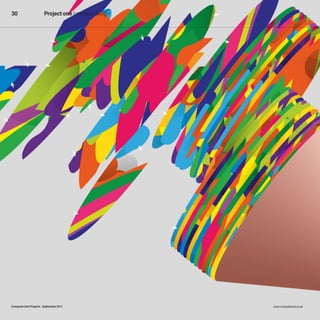
- 1. 30 Project one Interface design Computer Arts Projects _September 2011 www.computerarts.co.uk
- 2. From brief to screen 31 From brIeF to screen How do you turn a creative brief into a winning website design? Anne Wollenberg gets Illustration Hort the inside story on four exciting projects Could you turn a list of polling stations into establishing trust right from the start – an engaging design? What about creating clients with absolute confidence in their a website from cardboard milk cartons or web design team may allow them a surprising Lewis carroll-related artefacts? or designing amount of freedom. that said, the people you a compelling visual that will get people really need to understand are your users and excited about e-learning? just what will interest and engage them, turning a website brief into a whether you’re using parallax scrolling to client-pleasing design requires imagination, visualise a brochure or producing a series invention, and a detailed understanding of of games about the health benefits of milk. the client’s objectives and brand values. turn the page to find out how speaking to four creatives about these four project teams managed to crack these issues, all emphasised the importance of creative conundrums. Subscribe at www.myfavouritemagazines.co.uk/capp15 or see page 40 September 2011_ Computer Arts Projects
- 3. 32 Project one Interface design 01 overhauling the Got milk? site ALeX JenKIns LeD A teAm oF DesIGners AnD DeVeLoPers At UnIt9 on A mIssIon to GIVe tHe cALIFornIA mILK Processor boArD’s GotmILK.com A sUPerHero FAceLIFt 3 cLIent DesIGner 1 Paul Charney, Alex Jenkins, creative director at interactive art Goodby, Silverstein director & Partners London-based Paul charney studied freelance interactive art at brown University and director and designer worked as a copywriter Alex Jenkins was at several ad aganecies previously interactive as well as founding director at unit9. He has californian arts also worked as senior organisation Killing my interactive director at Lobster. charney joined b-reel and digital the ad agency Goodby, design director at Attik, silverstein & Partners, working on projects and based in san Francisco, campaigns for brands in 2006, and became including coca-cola, associate creative Virgin Active, Vodafone, director on the Got Doritos and Adobe milk? project. www. creative suite. www. goodbysilverstein.com alex-jenkins.co.uk 2 BRIEF: Charney says: “there were a couple of levels to the original brief. Firstly, the previous website was pretty old. It was still in a basic HtmL format and was just behind the times. the Got milk? campaign knew where it was at strategically and creatively, so the brand site needed to be just as impressive. the other key thing was the strategy itself – we were executing that milk is a super drink that does all these 01 Jenkins says: “the big 02 Jenkins says: “Heath 03 Jenkins says: “the key thing great things for you. It strengthens your hair, challenge was that this site had to live up robinson’s wacky illustrations inspired us is not to just think about how best to leverage strengthens your teeth and prevents brittle to the standards of the award-winning Got – they’re crazy contraptions that do very a brand, although that’s always there at the bones. It also rebuilds your muscles, so it’s milk? campaigns. I started off by exploring simple tasks, so there seemed to be a parallel back of your mind, but to consider how best great after a workout. interactive storytelling concepts. each game there. the image of the milk carton itself to encourage user interaction and strike a bryan Houlette and I were the on the site champions a different health was another inspiration, and we decided balance between effort and reward. so you associate creative directors overseeing the benefit and provides a link to a massive we wanted to create characters that felt like need to add little things – win a game and team coming up with the strategy before amount of information, so I spent quite a they’d been made out of milk cartons. We you can download one of the characters, developing the creative outlet for it. then bit of time thinking about how a user would played with the properties of what a card-like for example. that extra attention to detail is unit9 brought a lot of the production and experience this space. I didn’t want to create environment could offer – ping a pig out of a crucial. It’s an animation principle – you need creative details to the table.” a site where it felt like you were either playing cannon and if she misses, she crumples as to feel the human touches. Add what may games or digging for information – it was she hits the ground, for example. We made seem like small details and they all add up really important to make sure the two characters and portions of scenes flat-pack to a finished, polished piece of work.” weaved together seamlessly.” and sink into the floor. “ Computer Arts Projects _September 2011 www.computerarts.co.uk
- 4. From brief to screen 33 DEBRIEF: Charney says: “the website is really approachable and definitely true to the Got milk? campaign. everyone did such a great job. It worked so well because it has the brand attributes. It’s a really accessible site. It’s wholesome without being boring, and it shows the power of creativity. It’s really fun and surprising, and as long as it can live up to those qualities then people will be engaged. I think it’s also really clear – it’s not too confusing or esoteric. Websites can be closed-off and you can think: what am I here for, what am I doing? this one does a really good job. You see the milk cartons going through a conveyor belt – you click on something and get this little interactive experience that pops up about how milk helps rebuild muscles, so that’s why this little horse is on the treadmill and then drinks it. our client had a lot of faith and trust in the strategy itself. It’s a longstanding relationship and we take that very seriously.” Main image the fun yet informative site slotted in perfectly with the Got milk? campaign’s history and branding Subscribe at www.myfavouritemagazines.co.uk/capp15 or see page 40 September 2011_ Computer Arts Projects July
- 5. 34 Project one Interface design 02 Foursquare’s election site WHen FoUrsQUAre WAnteD to tUrn Acres oF VotInG DAtA Into An InterActIVe WebsIte, tHeY eLecteD Jess3 to PUt tHem on tHe mAP 3 cLIent DesIGner Eric Friedman, Robin Richards, director of business director of development at information design Foursquare at JESS3 eric Friedman studied born on st. Helena at George Washington Island, robin richards University. before joining studied in colchester, Foursquare, he worked essex, before returning at venture capital firm home and starting the Union square Ventures only design business in 2 and also spent three a 1,500-mile radius. He years at sem, seo and moved to bristol in 2009 social media agency and focused on start-up reprise media. infographics at a new eric has combined start-up before joining his entrepreneurial Jess3, where he works interests and on projects ranging from experience in product infographics and data management, finance, visualisation to marketing and account developing user management in his interfaces for web current work. and mobile platforms. www.foursquare.com www.jess3.com BRIEF: Friedman says: “the initial brief for the elections site was to encourage civic participation through awareness of voting locations. We wanted to show, in real time, where people were voting across the Us on an interactive, embeddable map. It was meant to be both live on the Foursquare site, as well as that of anyone 1 else who wanted to help people find their 01 Richards says: “Users are now 02 Richards says: “the custom 03 Richards says: “We reduced nearest voting location, and show the activity familiar with interactive maps, so we wanted map visual was both a creative and technical the site down to its core functions to show the on the day of the election. to use that knowledge and add a sense of challenge – we were recreating the whole of election through a Foursquare lens. All the Apart from showing check-ins, the discovery to the experience. the site needed the UsA. We decided to use open street map elements needed to meet this goal and serve site was also a resource for finding your local to show 100,000-plus polling stations across (osm) (www.openstreetmap.org) as the the data. If they did not, they were removed. polling station, and we wanted to provide the UsA, so the data visualisation on the map technical solution, and as a plus it also We also needed to be sure that we presented a high level overview of how the voting needed to work across different zoom levels. worked from a creative point of view. We the data in a clear and simple manner so that was going. so tracking the total number of When the user zooms out to a national level downloaded the raw map data from osm the average web user would understand check-ins, number of locations, the gender they get an overview of check-ins by state, and recreated it visually so it matched the it and wouldn’t have to work hard to split and activity across the four time zones whereas if they enter their zip code they get rest of the site and could be matched for the comprehend what they were looking at. of the Us was essential. these were then the nearest polling station and number of rendering process. We then had to create 12 everything had to be clean and clear so that presented as supporting features, allowing check-ins. Deciding what to show at these layers so the user could zoom in at different the user understood the design, making for the map to focus on elements related to the levels so as not to create an incomplete levels to view the information, allowing for a fun and enjoyable experience reflecting individual check-in locations.” experience was key.” streets and parks to be seen differently.” the identity of Foursquare.” Computer Arts Projects _September 2011 www.computerarts.co.uk
- 6. From brief to screen 35 DEBRIEF: Friedman says: “the brief didn’t change much from the initial idea as we kept the concept simple. the site turned out better than we imagined it would and we were extremely happy with the result. Initially, it was just focused on displaying check-ins. As the goals of the website evolved, so did the concepts – incorporating civil actions like encouraging people to vote, along with capturing and showcasing some of the conversation buzz around the elections. While continuing to make the data the main focal point, the other elements were incorporated in a simple, clear manner that made for easy discovery. We received word from people around the country, and the world, who would not have voted if they had not been pointed to the nearest location, and from those who were excited about us bringing them this information. by showing visually that every vote counts, we were able to inspire how people make a difference in an election.” Main image the interactive map not only gave users information on who was voting where, but actively encouraged them to vote Subscribe at www.myfavouritemagazines.co.uk/capp15 or see page 40 September 2011_ Computer Arts Projects
- 7. 36 Project one Interface design 03 translating moso’s e-learning brochure WHen toronto stArt-UP moso AsKeD cArtoGrAm to ‘WebIFY’ Its sALes brocHUre, tHe resULt WAs An IrreVerent concoctIon oF Dr. seUss-InsPIreD DesIGn 2 cLIent DesIGner Ross McKegney, Matthew Seccafien, chief operating founder of officer at Moso Cartogram Inc moso is a toronto- matthew seccafien based start-up is a web designer and company aiming to developer with a build a social platform passion for building for innovation. business long-lasting, accessible technologist and serial websites. He gained a entrepreneur ross bachelor of Design from mcKegney has a decade the York University and of experience in areas sheridan college design such as enterprise programme in ontario, management, product canada, and is based management, technical in toronto. His studio, pre-sales and software cartogram, was formed r&D. He also teaches in 2010 and is now technology strategy at a joint venture with 1 01 Seccafien says: “We wanted to the University of ontario his partner Fiona tie all the programme information together in Institute of technology mcDougall – who an interesting and fluid way, and a single-page and is an advisor to also worked on the several start-ups. moso project. www. vertical scrolling layout seemed a very natural www.moso.com studiocartogram.com means of enhancing information that dealt with education and professional progression. We were very eager to create a site that BRIEF: differentiated moso’s program from others like it and promoted its innovative aspects, McKegney says: “one of moso’s and we felt it would lend itself very well to first products is the Unfinished business bright colours and simple vector illustrations school (UFbs), a six-week hyperlocal training as well as using parallax scrolling. A more programme to teach managers the practical conservative website structure wouldn’t tools of business design. the impetus for the have communicated the level of innovation, UFbs site was that the first cohort of the creativity and layering of information that school was about to launch, a beta with six the UFbs programme is all about.” corporate clients, and a sales tool to promote and explain the programme was needed. 02 Seccafien says: “before we got 03 Seccafien says: “We then the site spec was initially to too carried away with our illustrative ideas and worked closely with Judelman to refine the 3 ‘webify’ our sales PDF, a four-page document elaborate scrolling techniques, we quickly ran typographic treatments, ensuring they were explaining the course’s format, modules and everything by mcKegrey and Greg Judelman, consistent with moso’s internal brand faculty. We wanted the site to stand out and moso’s design director, along with a mock-up communications. He had a clear idea of what make it clear this was an innovative social of some ideas for background illustrations. he wanted: bold and minimal, to contrast with learning experience. We needed something Initially, we imagined the site following a more the whimsical, playful illustrations, but not that would effectively communicate the literal translation of the programme booklet, cold or conservative. the project took just two details of our unique programme. which had all the information condensed. weeks from our first contact with moso to the the initial brief was very crude: After viewing our proof of concept, mcKegrey site being live and fully functional. there have boxes and arrow wireframes of the moso.com and Judelman fell in love with the idea and been a few minor refinements since then, homepage and the UFbs landing page, and what was to be a four-page site ballooned into mostly cross-browser compatibility tweaks a reskinning of the moso blog. We prioritised an 11-page Dr. seuss-inspired concotion as well as a few mobile browser issues, such UFbs, as that was the product we wanted to of interactivity, business and art. After our as the iPhone and iPad interpreting the focus on selling, but it was part of a larger concept was approved, we began producing scrolling awkwardly. We had fun and are very rebranding of the moso web presence.” the rest of the illustrations.” proud of what we managed to accomplish.” Computer Arts Projects _September 2011 www.computerarts.co.uk
- 8. From brief to screen 37 DEBRIEF: McKegney says: “the final site didn’t match the initial brief because what we asked for just wasn’t possible. the initial spec called for a site that matched the content structure of the course PDF – the intro, programme, and faculty. but then we realised that the information was far too dense, and we also started to see the incredible visual design talent cartogram brought to the table. the solution to the content density problem was to restructure the programme and faculty into six parallax scrolling ‘pages’, one per week. We chose to bump up the scope of the project and gave the team complete artistic freedom. We are extremely happy with the finished site. It communicates a fairly complex programme very effectively. beyond that, it differentiates moso and our UFbs from all the other related products on the market. this was a collaborative effort across companies – we got to where we did not from a cheques- and-balances process, but from a shared vision and unwavering trust in the team.” Main image the UFbs site turned a two-dimensional PDF brochure into an exciting, interactive user experience Subscribe at www.myfavouritemagazines.co.uk/capp15 or see page 40 September 2011_ Computer Arts Projects
- 9. 38 Project one Interface design 04 creating a magical online home for callooh callay mAt DoLPHIn Went tHroUGH tHe LooKInG GLAss to GIVe LeWIs cArroLL-InsPIreD LonDon bAr cALLooH cALLAY A WeIrD AnD WonDerFUL onLIne WonDerLAnD 3 2 cLIent DesIGner Richard Wynne, Tom Actman, director of Callooh creative director Callay bar at Mat Dolphin richard Wynne has tom Actman is a worked in every element multi-disciplinary of the bar world for over creative director a decade, from cellars specialising in graphic and cocktails to waiting, design and art direction. in high street chains to He studied at boutique cocktail bars. ravensbourne college co-director Kate and is co-founder of crutchley previously London-based design launched an arts space agency mat Dolphin, in east London and whose clients also organised product include Disney, Kodak, launches, gigs and Heineken and sony. He parties before joining worked with Phil cook, forces with Wynne to also creative director at open callooh callay in mat Dolphin, on the november 2008. www. callooh callay project. calloohcallaybar.com www.matdolphin.com BRIEF: Wynne says: “this project was ‘version two’ of the callooh callay website. We approached mat Dolphin to do this because our old website simply wasn’t working hard enough for us. We wanted to create something that would really reflect the personality of the bar, and give our customers a much clearer sense of what it’s actually like to go down the rabbit hole into callooh callay. 01 Actman says: “the brief was 02 Actman says: “our initial 03 Actman says: “the design the other really important thing relatively open. callooh callay is a quirky ideas were based on testing how much of process was relatively smooth. once the time was that we needed to be able to update the place with a great deal of character and this character we revealed and how much had been spent coming up with the overall website content ourselves. We have a lot to 1 personality. We were inspired by the space we alluded to without giving everything concept, the rest of the process fell into say, and our previous website didn’t allow us itself, and were really keen on the idea of away. the various objects that make up the place. Plenty of discussions early on in the to get this information across. so we needed taking the experience of going for a drink in navigation bar, such as the gramophone and design process ironed out any potential the ability to add a new menu or some callooh callay and translating it in a visually flamingo, were things we found around the problems before they became issues. this information about a special event, for interesting way. It’s a great little place bar and photographed. there are a number project really highlighted how much easier example, as and when we might want to.” with lots of interesting decor and hidden of different wallpapers at callooh callay, and more enjoyable a trusting client can surprises. the name is taken from the Lewis and we liked the idea of using a different make the design process. once richard carroll poem the Jabberwocky and it was wallpaper pattern for the background of each and Kate had seen our initial ideas and liked very important that the design hinted at this page, but when we came to try it the visuals them, they gave us a lot freedom to take our sense of fun, fantasy and magic. “ looked way too in-your-face, so that idea design ideas wherever we felt was right.” went in the bin.” Computer Arts Projects _ _September 2011 www.computerarts.co.uk
- 10. From brief to screen 39 DEBRIEF: Wynne says: “We love the site. mat Dolphin understood our brand and what we needed from the website. Ultimately, the studio ensured that the site worked for us – and it continues to work hard every day. the flow from page to page keeps a clear brand identity but also showcases the uniqueness of callooh callay and the fact that each room and page is a little discovery. the website is better than we could have envisaged. We feel it perfectly combines great design with practicality, which is a rarity. our website is very informative, clear, concise and easy to navigate, but what makes it really special is that our landing page holds the key to everything. You can see what callooh callay is up to and join in through the social media updates and links, so you know who we are, what we do, when we are open and everything that’s coming up. “ Main image the site was inspired by the space itself and encaptured its quirkiness and sense of mystery Subscribe at www.myfavouritemagazines.co.uk/capp15 or see page 40 September 2011_ Computer Arts Projects