Design and Designed Failures: From Observing Failurs To Provoking Them
•
18 likes•3,463 views

Failures and flops are often overlooked in design research. The talk addressed this issue by describing two approaches: observing design flops and identify symptoms of failures OR provoking failures to document user behavior... as a design tactic

Recommended
More Related Content
Similar to Design and Designed Failures: From Observing Failurs To Provoking Them
Similar to Design and Designed Failures: From Observing Failurs To Provoking Them (20)
More from nicolas nova
More from nicolas nova (20)
Recently uploaded
Recently uploaded (20)
Design and Designed Failures: From Observing Failurs To Provoking Them
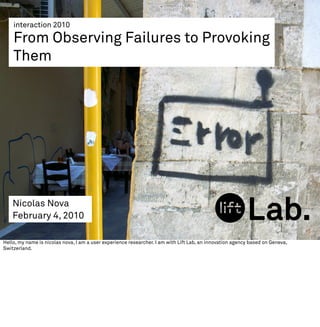
- 1. interaction 2010 From Observing Failures to Provoking Them Nicolas Nova February 4, 2010 Hello, my name is nicolas nova, I am a user experience researcher. I am with Lift Lab, an innovation agency based on Geneva, Switzerland.
- 2. I’m interested in product failures, mostly in the field of digital technologies such as internet services, mobile devices, networked objects and generally ubiquitous computing systems. This sort of obsession is going to be the topic of my talk today.
- 3. Failures and catastrophic usage of technologies have always fascinated me. If you’ve seen this movie, the beginning is fantastic: you see all these flying machines which crash here and there. It’s scary, hilarious and it also shows the courage of these innovators.
- 4. Todays’ product failures are then important to me. I cherish like the intelligent fridge for instance.
- 5. interest in product failures Or the so-called “video-phone”. Certainly a prominent example. The sort of device you had to have in a flying car. It was actually called the “picturephone” in 1964 when presented by AT&T at the New York World's Fair. 27$ per 3 minutes kind of prevent people from using it. And, as we will see with other examples, the company kept spending billions of $ in this project. AT&T finally decided to look at other markets in 1970 by selling this device for business purposes (for teleconference). But it failed again because of low-bandwidth to transfer image and sound. Even with the 1992 picturephone, there were still 5 seconds lag between voice and image! Further attempts of videophone service did not perform very well either and it took almost 40 years to figure this out.
- 6. “the future is already here. it's just not very evenly distributed.” William Gibson, 1993 Beyond this genuine fascination, the general assumption behind failures is that they can be seen as “seeds of the future” or “good ideas before their time”. As William Gibson, the science-fiction author, puts it in his well-known quote from a radio- interview back in 1993: “The future is already here, it's just not evenly distributed”. A common example lies in the use of personal communication with pictures, which failed several times in its phone instantiation, but is now a huge success with laptops, PCs, webcams and Skype.
- 7. good ideas before their time See for instance how video/VoIP evolved as a massive practice... while the video-phone never really made it.
- 8. learn from past failures In addition, understanding why something failed is a good input for design, perhaps even a “design strategy” where mistakes from the past are just seen as iterations towards a success. The iPhone or the iPad are not the first time Apple designed a touch-interface! Their work with the Newton product fifteen years ago definitely help them to create on the iphone.
- 9. observe failures in action to understand them non-usage real-time: accidents and people’s reaction to them afterwards: traces of bugs/ accidents What I want to focus on here is the fact that it’s one thing to point design flops, it’s another to explore what they mean and learn from them. What I’d like to suggest in this presentation is that learning about flops can be achieved by observing what I call “failure in action”: on the one hand you have accidents/error/bugs/glitches and people’s reaction to them, on the other hand, you have traces of failures and non-usage. As a user experience researcher, I am interested in how field research could be articulated with design to take failures into account. The underlying rationale of field research in design is generally to conduct studies so that the results can bring out insights, constraints and relevant material to design inventive or groundbreaking artifacts. Generally applied before, during or after the design process, this approach aims at providing both inspiration and a “reality check” to what has been produced, beyond the assumptions R&D stakeholders make about their potentials “users”.
- 10. 1. observe ‘failures in action’, draw lessons (classical annoyances from the 21st century) In the context of failures, this investigation can be tackled through two approaches. On the one hand, research can observe design flops, as proposed by Gaver et al. who examined the appropriation of a home health monitor device. The authors identified what they call ‘symptoms of failure’ by contrasting early trials results to a field study. It then allowed them to bring forward specific behavioral indicators to look for product failures and solve in following iterations.
- 11. Failure in action: automatic devices As a first case, let’s take a classical source of annoyance: automatic devices such as automatic doors and toilets. These generally open automatically, triggered by a motion sensor. You sometimes see people waving their hands, bumping their heads to the glassy door or trying to find a button. Each time I take a train in Switzerland, I try to sit next to the automatic doors between carriages. It’s always was a fantastic opportunity to observe the range of behavior people adopt when confronted to automatic doors. I did not count or ran precise analysis but I tried to categorize these behavior in a sort of ludicrous way: - Old people clueless about the sensor presence but slow enough to see the door opened when they approach it - People who knows that there’s a sensor, so they wait and go through the door - Commuters well-versed into swiss train sensors who wave their arm - People in the rush who almost run and bump into the door because the sensor did not have time to detect the body - Commuters who know how the sensor works, wave the arm and fail to open it (for some reason… because technology sucks), so step back and try again 1 or 2 times. A variant is when you have people then looking at the sensor, sometimes talking to it. - One person even tried to open the door manually but he failed because there is no clear handle (nor affordance) to do so. He the looked at me and sighted. Quite an interesting list and I am sure there can be other curious use case as I haven’t seen kids or people with loads of luggage.
- 12. Failure in action: automatic devices distinguish automatic from non-automatic invisible or illegible “locus of control”: floor? door side? too quickly/too slowly open when you don’t want it too weather-dependent calibration!? different “door” conventions The underlying variables here are the following: - The difficulty in distinguishing an automatic door from a non-automatic door - The invisible “locus of control” (as defined by Adam Greenfield in Everyware): when the environment becomes the interface, how do you know what to do? it’s simply not self-explanatory - The delay between body detection and opening of the door - The fact that the door sometimes open when you don’t want it too , especially when chatting with someone else (if you’re too close to the sensor) In sum, the problem lies in the fact that automatic doors have simply different different conventions than non-automatic ones. And people try to apply formerly effective conventions...
- 13. automatic doors: wrong mental model
- 14. solution to build a mental model In this case, the door trajectory has been represented on the floor with this red tape. It’s actually highly useful given the relatively high velocity of the door movement when opening (it’s slower though when the door automatically closes)
- 15. users unaware of sensors position and wrong calibration Even in the intimate sphere, things can get worse when the sensor is placed very high... you then need to wave your arm above your head while sitted on the toilet!
- 16. “15 minutes”: who decides this anyway? In a public restroom, I saw this insightful indicator of the “time available” to do your thing: 15 minutes. Who decided this? What train of thought led the design team to pick up this precise amount of time?
- 17. flawed sensors: 179.6 ºF Issues with sensors at not just about their positions and users’ mental models. Let me also remind you the great propension of sensors to go wrong. See this thermoter in France that indicates +82 degrees celsisus (179.6 ºF)... the poor bum who sleeps on the pavement would be toasted if this was the right temperature.
- 18. flawed sensors GPS and geolocation sensors often suffer for this problem too, see this example in a bus in Lisbon, Portugal. What happens when services like guidance and artifacts have a behavior based on sensor data?
- 19. that leads to wrong behavior This leads to this kind of paradoxical advice occur... as shown in this nice example that my colleague Fabien Girardin found few weeks ago.
- 20. or wrong indications Look at this picture I took of my iPhone the other day in Geneva. I think it would be good to start a catalogue of weird “failed GPS paths” patterns. The one above could be called “right way, wrong door”. The other day I Geneva, while going to a seminar, my iPhone GPS gave me this curious set of information that I liked a lot. I was looking for a building I’ve never been into and used the GPS device to help me. The “path solution” it gave me is the one above, strip naked in terms of urban elements (for some reasons, it’s only a grid as if I was playing “Space harrier“ on a Sega Master System). I simply had to go back on the avenue and find the entrance on the other side of the building. It left me wondering about the way navigation databases are aware of building entrances, surely a parameter that add a layer of complexity
- 21. processing = users need to be patient Another picture my colleague Fabien took recently that I find inspiring in terms of communicating about failures to the users. It says “processing new information”. In the 21st century, users need to be PATIENT. Like computers, we’re left to wait that some computation occur and that something will happen.
- 22. then we get meaningless results An example from the TV displays in the subway in Torino. Very aesthetical, but useless to me.
- 23. individual-blame bias (e. rogers) From the users’ standpoint, this is all bad... it often leads to what sociologists refer to as the “individual blame bias”, the tendency to attribute failure of use on people. In his book “Diffusion of Innovation“, Rogers gave the following example: “Posters were captioned: «LEAD PAINT CAN KILL!» Such posters placed the blame on low- income parents for allowing their children to eat paint peeling off the walls of older housing. The posters blamed the parents, not the pain manufacturers or the landlords. In the mid-1990s, federal legislation was enacted to require homeowners to disclose that a residence is lead-free when a housing unit is rented or sold.“
- 24. users get fed up At some point, this is simply what happens. Beyond a certain threshold, frustration leads to this. As a field researcher, it’s very rare to observe these reactions in real-time, so it’s a blessing when you see them happening and that you may understand why this big guy punched this poor light switch (the reason given: it didn’t work). The most common place where you see this happening = vending machines, which are often kicked.
- 25. future of robots = look at how people treat switches and vending machines! My intuition is that people will adopt the same behavior with robots. If you want to see the future of robots... look at how people treat switches and vending machines.
- 26. Love, hate and a hospital robot: http://cli.gs/T7VH6e ‘The fact that the robot couldn't tell if it was a good time to interrupt and announce its presence was a big problem for some people, as one member of the nursing staff described: "I called it nasty names and told it, 'Would you shut the hell up? Can't you see I'm on the phone? If you say "TUG has arrived" one more time I'm going to kick you in your camera.' " Some staff members actually did lash out and kick TUG in frustration, more admitted to considering it.’ And yes, this is what happens as found in this article in New Scientist.
- 27. 2. anti-probe: provoke failures and observe people’s behavior On the other hand, in my work, I am interested by a much more radical approach: provoking product failures as a way to document user behavior. What I mean here is the conscious design of questionable prototypes to investigate user experience. Drawing on the “probe” metaphor (see Bill Gaver’s work wth his team about this), the point is to have “anti-probe”: failed materialization of the principles of technology that can be shown to people to engage them in open-ended ways. It’s like throwing bananas in Super Mario Kart and observe your friends’ reactions, how they adapted. This alternative to start dialogue with users highlight inspirational data about how people would behave (and adjust their behavior, find solutions, solve problems). My position here is that the use of fieldwork in the context of non-usage (or flawed usage) can be a way to shed some light on original design questions.
- 28. Case 1: errors in a location- based games First example from a (now old) location-based game designed with my colleague Fabien Girardin back when we worked at the Swiss Institute of Technology in Lausanne. This game, called CatchBob! enabled us to run psychological experiments about the user experience of (self+others’) location-awareness.
- 29. "I did not move physically, but I saw me moving on the map!" “I saw that Ben moved on the screen but I know he did not". An interesting possibility in the context of services that tells where YOU are located and where YOUR friends/partners/contacts are located: test the different “acceptable” accuracies of positioning by: 1) Positioning the user where she/he is not (close to real location, a bit further, way further, etc.) 2) Positioning his partners where they are not (close to real location, a bit further, way further, etc.) And see people’s reactions...
- 30. Case 1: provoke failure as a way to understand users’ mental models This can be done as a way to understand the radius of the area people are comfortable being located in (for them, for others). To some extent, this is a way to understand the users’ mental model: Should positioning be accurate? What is an acceptable uncertainty? Could this be an iterated process to define a “comfort zone”? This material is of great inspiration to rely on during creative workshops, simply because it gives insights about HOW users react to failures. It allows to think about potential solutions to communicate malfunctioning (errors messages) or simply to find solutions so that users are not too bothered.
- 31. Case 2: wrong calibration on the Wii Another example from a video game project we conducted internally. Playing with the wiimote’s accelerometers sensibility.
- 32. Case 2: provoke failure as a tactic to change the user experience When programming the coding scheme that used the Wiimote (and nunchuk) sensors, we intentionally coded the effects of the gestures in the game to be HIGHLY sensitive to motion. Which means that small movements had really a big influence on the character’s movement in the digital game. At first, this was done to understand how people would react to sensibility and fine-tune it properly. But it seemed that players liked this utterly wrong calibration, as if it gave them a sort of “super-power”.
- 33. conclusion ➡ from failed products to “failures in actions” ➡ failures result from the incompatibilities between the way things are designed and the way people actually perceive, think, and act ➡ failures a design tactic: observing people’s reactions and/or provoking failures = explore what failure means and how users react/adapt/find their own solutions ➡ we collect design patterns, use cases, we should also collect “failure cases” as inspirational data ➡ next/to be discussed: which failures to provoke?
- 34. the future’s already here but it’s broken now it’s time to fix it