SlideShare une entreprise Scribd logo
1  sur  28
Télécharger pour lire hors ligne
BRAND
CONTACT
Address
Connect Company
7th Avenue, Manhattan
578 New York
United States
Phone | Fax | Online
Free Toll: + 1 020 7800 800
Phone: + 1 0800 123 123
Email: info@Connect.com
Website: www.Connect.com
Visual Brand Guidelines
Version 01 | 20-03-2021
2
Introduction
The Brand.
These guidelines describe the visual and verbal elements that represent
Connect corporate identity. This includes our name, logo and other
elements such as color, type and graphics. Sending a consistent and
controlled message of who we are is essential to presenting a strong,
unified image of our company.
These guidelines reflect Connect´s commitment to quality, consitency
and style. The Connect brand, including the logo, name, colors and
identifying elements, are valuable company assets.
Each of us is responsible for protecting the company’s interests by
preventing unauthorized or incorrect use of the
Connect name and marks.
Visual Brand Guidelines
3
Table of contents
From The President
Corporate Logo
Corporate Typography
Corporate Color
Corporate Stationery
Logo Placement
Corporate Iconography
Corporate Photography
04
08
14
20
26
32
36
40
Visual Brand Guidelines
4
From The President
We can all be proud of Connect’ accomplishments and confident in the company future: we are positioned
to find creative and innovative ways of addressing some of the great challenges facing
our world. Our common purpose is to ensure that Connect remains an exceptional place to work.
The Company Branding Guidelines help us to develop communications that speak to Connect’ unique
mission, characteristics, and spirit.
This manual provides clear guidelines so that we can
communicate the Connect brand consistently. Ensuring that we
adopt these standards across our communications will make
a significant contribution to enhancing Connect’ reputation.
The work of weaving the Company communications together is
ongoing. We can all play a role of thoughtful stewardship when
working to communicate Connect’ values and strengths.
Maria Kovich
Marian P. Kovich
President
Visual Brand Guidelines
5
Connect Brand Strategy
The Connect brand is much more than its seal and wordmark; the brand is reflected
in the Company's mission, core values, and strategic themes as communicated through
all our messaging and interactions with constituents.
The Connect brand as a whole is greater than the sum of its parts. Connect’
strong, recognized brand adds value to the individual companies under the
Connect umbrella—a rising tide lifts all boats.
In turn, the reputation of the company helps support and validates the equity of
the central Connect brand.
It’s important to strengthen and reinforce the central brand of Connect, and by
association that will strengthen and reinforce the reputation of the companies.
This is why, in all our communications, we aim to project a strong, unifying
singular voice and appearance.
While it may be tempting for companies, departments, and centers at Connect
to create their own brand/logo, this would only dilute awareness of the Connect
name and create internal competition or, at worst, confusion among our core
audiences.
Maintaining and strengthening our competitive position requires that all
components of the Connect brand appear consistently across all Company
communications.
No matter which communications channels are used, we all contribute to a
unified and professional Connect brand by following the logo, color, and typeface
standards in this guide. The new standards were informed by expertise in web,
social, print, photography, video, usability, and accessibility for people with
visual impairments.
The Branding Guidelines are flexible so that each company or unit can
communicate its own unique characteristics. Anchored by the Connect logo, you
may choose from the official colors and typefaces to define a visual presence that
is distinct yet clearly associated with Connect Company as the central primary
brand. You may also communicate a distinct brand by using photography, graphic
elements, and other visual assets.
Visual Brand Guidelines
6
01 | Corporate Logo
The Corporate Logo Signage.
Our Logo is the key building block of our identity, the
primary visual element that identifies us. The signature is
a combination of the the symbol itself and our company
name – they have a fixed relationship that should never
be changed in any way.
Visual Brand Guidelines | Corporate Logo
7
The Connect Masterbrand or Corporate Logo
comprises two elements, the logo symbol and logo
type. The Logo Symbol is a powerful image evoking
the culture of design services - the connection
between the strength of communication and the
different points that influence. It has a particular
relationship with the Connect name.
The Logo Type has been carefully chosen for its
modern and yet refined, highly legible style, which
has been further enhanced by the use of upper
case letters. The typeface is Montserrat Bold and
has also been chosen to compliment and balance
perfectly with the logo symbol.
The corporate logo is presented through the use
of colour as well as shape and form. The two
corporate colours are Yellow and Grey. It is a fresh
and appealing blend of colours chosen for their
strong combination - modern - classic - timeless.
The Colours have been selected according to
international standards as shown below and are
easily implemented.
Visual Brand Guidelines | Corporate Logo
The Full Logotype
1
1) The Logo Symbol
Consists of a powerful element
evoking the culture of design
services and a red armor
backround.
2
2) The Logo Title
Carefully chosen for its modern and yet refined, highly
legible style, which has been further enhanced by the use
of upper case letters in black tone of the chosen corporate
color. The font that is used here is Your font Bold.
3) The General Logo
The main logo is the dark logo used on white or colored backround.
3
Logo Variants
Choosing the right dominant color for
your brand is crucial. This color should
appear on all your materials, including
your logo and packaging.
8
It is important to keep corporate marks clear of any other graphic elements. To regulate this, an exclusion zone has been established around the corporate mark. This
exclusion zone indicates the closest any other graphic element or message can be positioned in relation to the mark.of the the symbol itself and our company name –
they have a fixed relationship that should never be changed in any way.
Logo Construction & Clearspace
Visual Brand Guidelines | Corporate Logo
x
2x
3x
2x
Logo Clearspace
The area that surrounds the logo
known as “clear space” is as
important as the logo itself
1/2x 1/2x 1/2x
1/2x 1/2x
1/2x
1/2x
1/2x
9
A logo lockup refers to the formalized position/relationship of the brand’s logo (symbol) and its wordmark (logotype)
Logo Minimum Size
Visual Brand Guidelines | Corporate Logo
Minimum SIze
A logotype refers to words or the
name of a business that is designed
in a special way. Examples include
Pinterest, eBay or Google.
3x
5x
10
Aa
Visual Brand Guidelines | Corporate Typography
02 | Corporate Typography
The corporate Fonts and typography
Typographic hierarchy is another form of visual hierarchy, a
sub-hierarchy per se in an overall design project. Typographic
hierarchy presents lettering so that the most important words
are displayed with the most impact so users can scan text
for key information. Typographic hierarchy creates contrast
between elements. There are a variety of ways you can create
a sense of hierarchy. Here are some of the most common
techniques for Connect.Inc layouts.
11
Visual Brand Guidelines | Corporate Typography
Brand Typeface
Typography plays a crucial role in the design of your brand identity. The typography in your logo can be
as impactful as a graphic
Fira-Sans Font
Fira Sans was designed to be a text face that is
pleasant to read on screens. It features a very
large x height, slightly condensed letterforms, a
mild diagonal stress, sturdy serifs and open forms.
There is also Fira Sans Sans, a sans-serif version
which closely harmonizes with the weights and
styles of this serif family.
The Fira Sans project is led by Sorkin Type, a type
design foundry based in Western Massachaussets,
USA.
Montserrat Font
Montserrat is a well-balanced contemporary serif
with roots in calligraphy. It is a text typeface with
moderate contrast well suited for body text.
A paragraph set in Montserrat will make a
memorable appearance because of its brushed
curves in contrast with driving serifs. The overall
typographic voice of Montserrat perfectly
conveys the mood of a modern-day story, or an
art essay.
Technically Montserrat is optimised for screen
appearance, and works equally well in print.
12
Primary Typeface
Visual Brand Guidelines | Corporate Typography
Montserrat Font
Montserrat Bold
ABCDEFGHIJKLNOPQRSTUVWXYZ
abcdefghijklnopqrstuvwxyz
1234567890!@£$%^&
Montserrat Regular
ABCDEFGHIJKLNOPQRSTUVWXYZ
abcdefghijklnopqrstuvwxyz
1234567890!@£$%^&
ABCDEFGHIJKL
NOPQRSTUVWXYZ
abcdefghijklnop
qrstuvwxyz
1234567890!@£$%^&
Styles
Regular
Regular Italic
Bold
Bold Italic
Montserrat is a free typeface
and can be downloaded here:
https://fonts.google.com/
specimen/Montserrat
13
Secondary Typeface
Visual Brand Guidelines | Corporate Typography
Fira-Sans Font
Fira Sans Bold
ABCDEFGHIJKLNOPQRSTUVWXYZ
abcdefghijklnopqrstuvwxyz
1234567890!@£$%^&
Fira Sans Light
ABCDEFGHIJKLNOPQRSTUVWXYZ
abcdefghijklnopqrstuvwxyz
1234567890!@£$%^&
ABCDEFGHIJKL
NOPQRSTUVWXYZ
abcdefghijklnop
qrstuvwxyz
1234567890!@£$%^&
Styles
Regular
Regular Italic
Bold
Bold Italic
Fira Sans is a free typeface and
can be downloaded here:
https://fonts.google.com/
specimen/Fira Sans
14
03 | Corporate Color
The Corporate Color Codes.
Visual Brand Guidelines | Corporate Color
Color plays an important role in the Connect.Inc corporate
identity program. The colors below are recommendations for
various media. A palette of primary colors has been developed,
which comprise the “One Voice” color scheme. Consistent use
of these colors will contribute to the cohesive and harmonious
look of the Connect.Inc brand identity across all relevant media.
Check with your designer or printer when using the corporate
colors that they will be always be consistent.
15
Visual Brand Guidelines | Corporate Color
The Corporate Color Strategy
The corporate color system reflects a rich, dynamic, multi-dimensional Connect. Connect is no longer simply a
onedimensional “red” company. We will retain red as the primary corporate color, but only use it in deliberate ways
as an accent that elevates it to “special” status; a nod to our history that is reinforced in every communication
The system
The existing Connect red/Blue corporate palette has been expanded to include the use of both dynamic and neutral colors that
complement each other and can be used in any combination as long as the integrity of the brand is not diminished.
Amaranth Catalina Blue Jelly Bean Charlotte Panache
16
Primary Colors
Explanation:
The Connect.Inc Company has Two official colors:
Red and Blue. These colors have become a
recognizable identifier for the company.
Usage:
Use them as the dominant color palette for all
internal and external visual presentations of the
company.
HEX
RGB
HSV
CMYK
#e63946
230 57 70
355 75 90
0 75 70 10
HEX
RGB
HSV
CMYK
#1d3557
29 53 87
215 67 34
67 39 0 66
Almost 90% of people’s assessment on products
or services is based on colors alone. Due to
colors’ strong influence on moods and feelings,
their association with products can influence our
attitudes and affect purchasing power towards
brands.
Visual Brand Guidelines | Corporate Color
17
Secondary Colors
Explanation:
The Secondary colors are complementary to our
official colors, but are not recognizable identifiers
for our company. Secondary colors should be used
sparingly (less than 10 % of the palette in one
piece.
Usage:
Use them to accent and support the primary color
palette.
HEX
RGB
HSV
CMYK
#457b9d
69 123 157
203 56 62
56 22 0 38
HEX
RGB
HSV
CMYK
#a8dadc
168 218 220
182 24 86
24 1 0 14
HEX
RGB
HSV
CMYK
#f1faee
241 250 238
105 5 98
4 0 5 2
Color palette choices are used to differentiate
items, create depth, add emphasis, and help
organize information
Visual Brand Guidelines | Corporate Color
18
The Company Letterhead
Visual Brand Guidelines | Corporate Stationery
x
x
x
X
3X
3X
x
2X
FRONT DESIGN BACK DESIGN
Size : 210mm (w) x 297mm (h)
Paper : Impact Lenza 130 gsm 100%
Printing : 4 col. offset front printing
Front side
Logo size : 12mm (h)
Safe space = height of the logo (12 mm) from all 4
sides Position : Top right (top right aligned to the
letterhead)
Office address : 10pt Fira Sans Regular dark grey
Height of the identity bar = 6mm
* Specifications for continuation sheet is the same, except
that there will be no address on it.
restricted area for logotype including
the the safe space
Connect.Inc Company
7th Avenue, Manhattan 578, New York, United States
E: info@design-inc.com
P: +01.132.4567.890
x
x
1/2x
19
The Company Envelope
Visual Brand Guidelines | Corporate Stationery
Size : 235mm (w) x 108mm (h) / 9.25”(w) X 4.25” (h)
Paper : Impact Lenza 130 gsm 100%
Printing : 4 col. offset front printing
Front side
Logo size : 9mm (h)
Safe space = height of the logo (9 mm) from all 4 sides
Position : Top left (top right aligned to the envelop)
Office address :
Company Name in 9pt Fira Sans Bold with 18pt line spacing.
Addresses in 9pt Fira Sans Regular with 15pt line spacing in dark grey
(70%) 9pt Fira Sans Regular dark grey (70%)
Height of the identity bar = 4.5mm
FRONT DESIGN
BACK DESIGN
x
x
x
x
restricted area for logotype including
the the safe space
20
The Company Business Card
Visual Brand Guidelines | Corporate Stationery
Size : 90mm (w) x 50mm (h)
Paper : Impact Lenza 300 gsm 100% recycled
Printing : 4 col. digital front and back printing
Finish : Both side Aqueous coat overprint
Front side
Background : C100, M20, Y0, K0
Logo size : 6mm (h)
Safe space = height of the logo (6 mm)
Position : Top right
Individual’s information
Position : Bottom left (3mm margin from left) Font
: Fira Sans
Name of the person : 8pt (Bold)
Designation : 7pt (Regular) Gray
Contact numbers : 7pt (Regular) Gray
E-Mail : 7pt (Regular) White
Office address : 6pt (Regular) White
Height of the identity bar = 3mm
x
x
x
x
restricted area for logotype including
the the safe space
FRONT DESIGN
BACK DESIGN
X
2X
Connect.Inc Company
7th Avenue, Manhattan 578, New York, United States
E: info@design-inc.com
P: +01.132.4567.890
x
x
x
1/2x
Name of the Person
Designation
Contact number (country 1)
Contact number (country 2)
Email.Address@kpit.com
21
The Company Email Signature
Visual Brand Guidelines | Corporate Stationery
Mark David / Business Developemnt
mdavid@Connect.com / 305-999-9999
Connect, lnc
www.Connect.com
Fira Sans Bold , 12pt
Fira Sans Regualr , 12pt
LOGO
Name / Position
Email / Phone Number
Company Name
Website
Name in 10pt Segeo UI bold in Dark Grey
Body Text in 9pt Segeo UI regular in Dark Grey
URL and Social media links in Dark Grey - 9pt
“Connect” in 12pt Bold in Connect Red
Any partner logo / Award logo should appear in the next time after the social media links
In no case should the Connect logo be used as part of the email signature
Please do not COPY the signature directly from here (given on the right hand side of this page).
Kindly head to https://Connect.com and look for the file titled,
"Corporate email signature.docx". This file also carries the format you can copy and
the instructions on how you can create your own email signature in the given format.
22
05 | Logo Placement
The correct Logo Placement
Whenever possible, the Connect logo should be placed in the upper right corner of the
webpage/page in full color, on a white background.
Logo placement helps build Linexor brand awareness. On printed material like a
letterhead, a business card or an envelope, double the distance of the letters “ou”
around the edge. We have created two examples that illustrate this concept.
Print
In print applications, “initial view” refers to the cover of materials with multiple pages
or the front of one-sided
materials. For two-sided materials, the logo can appear on either side depending on
design.
Email
For HTML emails such as department newsletters, the logo must appear somewhere
within the message. It does not need to be in the header.
Website
The logo must appear before any user interaction (click, scroll, input, etc.).
Visual Brand Guidelines | Logo Placement
23
Visual Brand Guidelines | Logo Placement
The Right Place For Logo
To place the Connect.Inc logo in the correct way please use one of the approved styles that are shown on the right. To place the Connect.Inc logo in other ways is not allowed.
Spacing for Primary Placement
0.3x
x
Spacing for secondary Placement
0.3x
x
x
2x
x
x
restricted area for logotype including
the the safe space
8.5x11 in
x
x
x
x
restricted area for logotype including
the the safe space
8.5x11 in
24
06 | Corporate Iconography
Corporate Iconography System
Icons are graphics that take up a small amount of space and
provide a quick, intuitive representation of an action, status,
or functionality. In order to ensure that icons retain their
ability to communicate clearly and succinctly,it’s important not
to dilute the system by creating new versions or variations of
the existing icon set.
Icons are:
• Helpful in adding visual interest and making a page more
scannable.
• More and more commonplace as screens get smaller and real
estate is increasingly scarce.
Icons are not:
• Wholesale replacements for text.
• Appropriate for enlargement and use as illustrations.
• Used for more than one defined representation.
Visual Brand Guidelines | Corporate Iconography
25
Visual Brand Guidelines | Corporate Iconography
Connect Icons
Wherever possible icons should be created in a
flat icon style using Connect Cool Grey (Pantone
3c) paired with one other Connect colour.
An icon is a pictogram displayed on a screen or
print layout in order to help the user navigate
through the content in a easier way. The icon
itself is a small picture or symbol serving as a
quick, “intuitive” representation of a software
tool, function or a data file.
Examples for Connect.inc
Corporate iconography System
-
How to:
- only use icon with a backround
- minimum stroke size: 0.5 pt
- upscale only proportional
Podcast Global Filter Calendar Tag
Recruit Popular Secure Area Audiences
REPRESENTATIONAL
Icons are graphics that take
up a small amount of space
and provide a quick, intuitive
representation of an action,
status, or functionality.
Connect Search Email Audio
ACTION - ORIENTED
Icons are graphics that take
up a small amount of space
and provide a quick.
Previous Next Close Accordian Open Accordian
Menu Close More Enlarge
WAYFINDING
Icons are graphics that take
up a small amount of space
and provide a quick, intuitive
representation of an action,
status, or functionality.
26
Visual Brand Guidelines | Corporate Photography
07 | Corporate Photography
Corporate Images and Blending Modes.
Corporate Images are responsible to transfer the values of Design.Inc to our customers or our potential customers. It is a
composite psychological impression that continually changes with the firm’s circumstances, media coverage, performance,
pronouncements, etc. Connect.Inc use various corporate advertising techniques to enhance their public image in order to
improve their desirability as a supplier, employer, customer, borrower, partner, etc.
Photography
Photography and illustrations are powerful and emotive tools that express our values just as strongly as colours and typefaces.
These guidelines should help you think about images, but they cannot cover every decision you have to make. You need to use
your judgment and discretion. In particular, avoid clipart or any other prefabricated images from the internet. These suggest a
lack of effort and imagination, and can risk looking like a crude ‘cut and paste’, rather than careful selection. The quality of such
images, like that of other illustrations, can also be hard to control.
27
Visual Brand Guidelines | Corporate Photography
www.Connect.com
CONTACT
Address
Connect Company
7th Avenue, Manhattan
578 New York
United States
Phone | Fax | Online
Free Toll: + 1 020 7800 800
Phone: + 1 0800 123 123
Email: info@Connect.com
Website: www.Connect.com

Contenu connexe

Similaire à Brand Manual Guide US Letter size for corporates

How to Integrate Your Brand into All Aspects of Your Design
How to Integrate Your Brand into All Aspects of Your DesignHow to Integrate Your Brand into All Aspects of Your Design
How to Integrate Your Brand into All Aspects of Your DesignFiverr
 
No-Nonsense Logo Design Tips For Small Business Owners
No-Nonsense Logo Design Tips For Small Business OwnersNo-Nonsense Logo Design Tips For Small Business Owners
No-Nonsense Logo Design Tips For Small Business OwnersDesignMantic
 
UNDERSTANDING THE ELEMENTS OF BRAND IDENTITY
UNDERSTANDING THE ELEMENTS OF BRAND IDENTITYUNDERSTANDING THE ELEMENTS OF BRAND IDENTITY
UNDERSTANDING THE ELEMENTS OF BRAND IDENTITYrameshbabu91988
 
This doctor dumped US job to build integrated medicine platform Syncremedies
This doctor dumped US job to build integrated medicine platform SyncremediesThis doctor dumped US job to build integrated medicine platform Syncremedies
This doctor dumped US job to build integrated medicine platform Syncremediesvinay vinu
 
Clearwater Branding - Introduction to Our Business
Clearwater Branding - Introduction to Our BusinessClearwater Branding - Introduction to Our Business
Clearwater Branding - Introduction to Our BusinessClearwater Branding
 
Corporate Brand & Style Guidelines
Corporate Brand & Style GuidelinesCorporate Brand & Style Guidelines
Corporate Brand & Style GuidelinesSalt Lake Chamber
 
Brandon University Visual Standards Guide: Version 1.0
Brandon University Visual Standards Guide: Version 1.0Brandon University Visual Standards Guide: Version 1.0
Brandon University Visual Standards Guide: Version 1.0Alex Beshara
 
Designing Logos and Corporate Stationary
Designing Logos and Corporate StationaryDesigning Logos and Corporate Stationary
Designing Logos and Corporate StationaryRavi Bhadauria
 
Aim Group International | Logo Guide
Aim Group International | Logo GuideAim Group International | Logo Guide
Aim Group International | Logo Guidenickygenov
 
Brand Guideline for Empirico
Brand Guideline for EmpiricoBrand Guideline for Empirico
Brand Guideline for Empiricobrendayin
 
Infogroup Branding Guidelines
Infogroup Branding GuidelinesInfogroup Branding Guidelines
Infogroup Branding GuidelinesBriana Lauren
 
Visit your state or countys website where vital statistical infor.docx
Visit your state or countys website where vital statistical infor.docxVisit your state or countys website where vital statistical infor.docx
Visit your state or countys website where vital statistical infor.docxdickonsondorris
 
What’s the Difference Between Logo Design and Branding.pptx
What’s the Difference Between Logo Design and Branding.pptxWhat’s the Difference Between Logo Design and Branding.pptx
What’s the Difference Between Logo Design and Branding.pptxInterics Designs Pvt Ltd
 

Similaire à Brand Manual Guide US Letter size for corporates (20)

How to Integrate Your Brand into All Aspects of Your Design
How to Integrate Your Brand into All Aspects of Your DesignHow to Integrate Your Brand into All Aspects of Your Design
How to Integrate Your Brand into All Aspects of Your Design
 
Solidarity takaful brand guidelines
Solidarity takaful brand guidelinesSolidarity takaful brand guidelines
Solidarity takaful brand guidelines
 
Elements_of_Logo_Design.ppt
Elements_of_Logo_Design.pptElements_of_Logo_Design.ppt
Elements_of_Logo_Design.ppt
 
No-Nonsense Logo Design Tips For Small Business Owners
No-Nonsense Logo Design Tips For Small Business OwnersNo-Nonsense Logo Design Tips For Small Business Owners
No-Nonsense Logo Design Tips For Small Business Owners
 
UNDERSTANDING THE ELEMENTS OF BRAND IDENTITY
UNDERSTANDING THE ELEMENTS OF BRAND IDENTITYUNDERSTANDING THE ELEMENTS OF BRAND IDENTITY
UNDERSTANDING THE ELEMENTS OF BRAND IDENTITY
 
This doctor dumped US job to build integrated medicine platform Syncremedies
This doctor dumped US job to build integrated medicine platform SyncremediesThis doctor dumped US job to build integrated medicine platform Syncremedies
This doctor dumped US job to build integrated medicine platform Syncremedies
 
BWBrandFinal
BWBrandFinalBWBrandFinal
BWBrandFinal
 
Clearwater Branding - Introduction to Our Business
Clearwater Branding - Introduction to Our BusinessClearwater Branding - Introduction to Our Business
Clearwater Branding - Introduction to Our Business
 
Corporate Brand & Style Guidelines
Corporate Brand & Style GuidelinesCorporate Brand & Style Guidelines
Corporate Brand & Style Guidelines
 
Brandon University Visual Standards Guide: Version 1.0
Brandon University Visual Standards Guide: Version 1.0Brandon University Visual Standards Guide: Version 1.0
Brandon University Visual Standards Guide: Version 1.0
 
Designing Logos and Corporate Stationary
Designing Logos and Corporate StationaryDesigning Logos and Corporate Stationary
Designing Logos and Corporate Stationary
 
Circles - Brandbook
Circles - BrandbookCircles - Brandbook
Circles - Brandbook
 
Logo Design
Logo Design Logo Design
Logo Design
 
Aim Group International | Logo Guide
Aim Group International | Logo GuideAim Group International | Logo Guide
Aim Group International | Logo Guide
 
Logo anaylsis
Logo anaylsisLogo anaylsis
Logo anaylsis
 
Brand Guideline for Empirico
Brand Guideline for EmpiricoBrand Guideline for Empirico
Brand Guideline for Empirico
 
Infogroup Branding Guidelines
Infogroup Branding GuidelinesInfogroup Branding Guidelines
Infogroup Branding Guidelines
 
Visit your state or countys website where vital statistical infor.docx
Visit your state or countys website where vital statistical infor.docxVisit your state or countys website where vital statistical infor.docx
Visit your state or countys website where vital statistical infor.docx
 
Wilson Portfolio 2017
Wilson Portfolio 2017Wilson Portfolio 2017
Wilson Portfolio 2017
 
What’s the Difference Between Logo Design and Branding.pptx
What’s the Difference Between Logo Design and Branding.pptxWhat’s the Difference Between Logo Design and Branding.pptx
What’s the Difference Between Logo Design and Branding.pptx
 

Dernier

The Pitfalls of Keyword Stuffing in SEO Copywriting
The Pitfalls of Keyword Stuffing in SEO CopywritingThe Pitfalls of Keyword Stuffing in SEO Copywriting
The Pitfalls of Keyword Stuffing in SEO CopywritingJuan Pineda
 
TAM AdEx 2023 Cross Media Advertising Recap - Auto Sector
TAM AdEx 2023 Cross Media Advertising Recap - Auto SectorTAM AdEx 2023 Cross Media Advertising Recap - Auto Sector
TAM AdEx 2023 Cross Media Advertising Recap - Auto SectorSocial Samosa
 
Do More with Less: Navigating Customer Acquisition Challenges for Today's Ent...
Do More with Less: Navigating Customer Acquisition Challenges for Today's Ent...Do More with Less: Navigating Customer Acquisition Challenges for Today's Ent...
Do More with Less: Navigating Customer Acquisition Challenges for Today's Ent...Search Engine Journal
 
Omnichannel Marketing: Defining Omnichannel Marketing
Omnichannel Marketing: Defining Omnichannel MarketingOmnichannel Marketing: Defining Omnichannel Marketing
Omnichannel Marketing: Defining Omnichannel MarketingDove Soft Ltd
 
GreenSEO April 2024: Join the Green Web Revolution
GreenSEO April 2024: Join the Green Web RevolutionGreenSEO April 2024: Join the Green Web Revolution
GreenSEO April 2024: Join the Green Web RevolutionWilliam Barnes
 
Local SEO Domination: Put your business at the forefront of local searches!
Local SEO Domination:  Put your business at the forefront of local searches!Local SEO Domination:  Put your business at the forefront of local searches!
Local SEO Domination: Put your business at the forefront of local searches!dstvtechnician
 
Word Count for Writers: Examples of Word Counts for Sample Genres
Word Count for Writers: Examples of Word Counts for Sample GenresWord Count for Writers: Examples of Word Counts for Sample Genres
Word Count for Writers: Examples of Word Counts for Sample GenresLisa M. Masiello
 
How videos can elevate your Google rankings and improve your EEAT - Benjamin ...
How videos can elevate your Google rankings and improve your EEAT - Benjamin ...How videos can elevate your Google rankings and improve your EEAT - Benjamin ...
How videos can elevate your Google rankings and improve your EEAT - Benjamin ...Benjamin Szturmaj
 
BrightonSEO - Addressing SEO & CX - CMDL - Apr 24 .pptx
BrightonSEO -  Addressing SEO & CX - CMDL - Apr 24 .pptxBrightonSEO -  Addressing SEO & CX - CMDL - Apr 24 .pptx
BrightonSEO - Addressing SEO & CX - CMDL - Apr 24 .pptxcollette15
 
Storyboards for my Final Major Project Video
Storyboards for my Final Major Project VideoStoryboards for my Final Major Project Video
Storyboards for my Final Major Project VideoSineadBidwell
 
marketing strategy of tanishq word PPROJECT.pdf
marketing strategy of tanishq word PPROJECT.pdfmarketing strategy of tanishq word PPROJECT.pdf
marketing strategy of tanishq word PPROJECT.pdfarsathsahil
 
The Skin Games 2024 25 - Sponsorship Deck
The Skin Games 2024 25 - Sponsorship DeckThe Skin Games 2024 25 - Sponsorship Deck
The Skin Games 2024 25 - Sponsorship DeckToluwanimi Balogun
 
Cost-effective tactics for navigating CPC surges
Cost-effective tactics for navigating CPC surgesCost-effective tactics for navigating CPC surges
Cost-effective tactics for navigating CPC surgesPushON Ltd
 
Influencer Marketing Power point presentation
Influencer Marketing  Power point presentationInfluencer Marketing  Power point presentation
Influencer Marketing Power point presentationdgtivemarketingagenc
 
Call Girls in Lajpat Nagar Delhi 💯Call Us 🔝8264348440🔝
Call Girls in Lajpat Nagar Delhi 💯Call Us 🔝8264348440🔝Call Girls in Lajpat Nagar Delhi 💯Call Us 🔝8264348440🔝
Call Girls in Lajpat Nagar Delhi 💯Call Us 🔝8264348440🔝soniya singh
 
DIGITAL MARKETING STRATEGY_INFOGRAPHIC IMAGE.pdf
DIGITAL MARKETING STRATEGY_INFOGRAPHIC IMAGE.pdfDIGITAL MARKETING STRATEGY_INFOGRAPHIC IMAGE.pdf
DIGITAL MARKETING STRATEGY_INFOGRAPHIC IMAGE.pdfmayanksharma0441
 
Mastering SEO in the Evolving AI-driven World
Mastering SEO in the Evolving AI-driven WorldMastering SEO in the Evolving AI-driven World
Mastering SEO in the Evolving AI-driven WorldScalenut
 
Digital Marketing Spotlight: Lifecycle Advertising Strategies.pdf
Digital Marketing Spotlight: Lifecycle Advertising Strategies.pdfDigital Marketing Spotlight: Lifecycle Advertising Strategies.pdf
Digital Marketing Spotlight: Lifecycle Advertising Strategies.pdfDemandbase
 
DGR_Digital Advertising Strategies for a Cookieless World_Presentation.pdf
DGR_Digital Advertising Strategies for a Cookieless World_Presentation.pdfDGR_Digital Advertising Strategies for a Cookieless World_Presentation.pdf
DGR_Digital Advertising Strategies for a Cookieless World_Presentation.pdfDemandbase
 
Red bull marketing presentation pptxxxxx
Red bull marketing presentation pptxxxxxRed bull marketing presentation pptxxxxx
Red bull marketing presentation pptxxxxx216310017
 

Dernier (20)

The Pitfalls of Keyword Stuffing in SEO Copywriting
The Pitfalls of Keyword Stuffing in SEO CopywritingThe Pitfalls of Keyword Stuffing in SEO Copywriting
The Pitfalls of Keyword Stuffing in SEO Copywriting
 
TAM AdEx 2023 Cross Media Advertising Recap - Auto Sector
TAM AdEx 2023 Cross Media Advertising Recap - Auto SectorTAM AdEx 2023 Cross Media Advertising Recap - Auto Sector
TAM AdEx 2023 Cross Media Advertising Recap - Auto Sector
 
Do More with Less: Navigating Customer Acquisition Challenges for Today's Ent...
Do More with Less: Navigating Customer Acquisition Challenges for Today's Ent...Do More with Less: Navigating Customer Acquisition Challenges for Today's Ent...
Do More with Less: Navigating Customer Acquisition Challenges for Today's Ent...
 
Omnichannel Marketing: Defining Omnichannel Marketing
Omnichannel Marketing: Defining Omnichannel MarketingOmnichannel Marketing: Defining Omnichannel Marketing
Omnichannel Marketing: Defining Omnichannel Marketing
 
GreenSEO April 2024: Join the Green Web Revolution
GreenSEO April 2024: Join the Green Web RevolutionGreenSEO April 2024: Join the Green Web Revolution
GreenSEO April 2024: Join the Green Web Revolution
 
Local SEO Domination: Put your business at the forefront of local searches!
Local SEO Domination:  Put your business at the forefront of local searches!Local SEO Domination:  Put your business at the forefront of local searches!
Local SEO Domination: Put your business at the forefront of local searches!
 
Word Count for Writers: Examples of Word Counts for Sample Genres
Word Count for Writers: Examples of Word Counts for Sample GenresWord Count for Writers: Examples of Word Counts for Sample Genres
Word Count for Writers: Examples of Word Counts for Sample Genres
 
How videos can elevate your Google rankings and improve your EEAT - Benjamin ...
How videos can elevate your Google rankings and improve your EEAT - Benjamin ...How videos can elevate your Google rankings and improve your EEAT - Benjamin ...
How videos can elevate your Google rankings and improve your EEAT - Benjamin ...
 
BrightonSEO - Addressing SEO & CX - CMDL - Apr 24 .pptx
BrightonSEO -  Addressing SEO & CX - CMDL - Apr 24 .pptxBrightonSEO -  Addressing SEO & CX - CMDL - Apr 24 .pptx
BrightonSEO - Addressing SEO & CX - CMDL - Apr 24 .pptx
 
Storyboards for my Final Major Project Video
Storyboards for my Final Major Project VideoStoryboards for my Final Major Project Video
Storyboards for my Final Major Project Video
 
marketing strategy of tanishq word PPROJECT.pdf
marketing strategy of tanishq word PPROJECT.pdfmarketing strategy of tanishq word PPROJECT.pdf
marketing strategy of tanishq word PPROJECT.pdf
 
The Skin Games 2024 25 - Sponsorship Deck
The Skin Games 2024 25 - Sponsorship DeckThe Skin Games 2024 25 - Sponsorship Deck
The Skin Games 2024 25 - Sponsorship Deck
 
Cost-effective tactics for navigating CPC surges
Cost-effective tactics for navigating CPC surgesCost-effective tactics for navigating CPC surges
Cost-effective tactics for navigating CPC surges
 
Influencer Marketing Power point presentation
Influencer Marketing  Power point presentationInfluencer Marketing  Power point presentation
Influencer Marketing Power point presentation
 
Call Girls in Lajpat Nagar Delhi 💯Call Us 🔝8264348440🔝
Call Girls in Lajpat Nagar Delhi 💯Call Us 🔝8264348440🔝Call Girls in Lajpat Nagar Delhi 💯Call Us 🔝8264348440🔝
Call Girls in Lajpat Nagar Delhi 💯Call Us 🔝8264348440🔝
 
DIGITAL MARKETING STRATEGY_INFOGRAPHIC IMAGE.pdf
DIGITAL MARKETING STRATEGY_INFOGRAPHIC IMAGE.pdfDIGITAL MARKETING STRATEGY_INFOGRAPHIC IMAGE.pdf
DIGITAL MARKETING STRATEGY_INFOGRAPHIC IMAGE.pdf
 
Mastering SEO in the Evolving AI-driven World
Mastering SEO in the Evolving AI-driven WorldMastering SEO in the Evolving AI-driven World
Mastering SEO in the Evolving AI-driven World
 
Digital Marketing Spotlight: Lifecycle Advertising Strategies.pdf
Digital Marketing Spotlight: Lifecycle Advertising Strategies.pdfDigital Marketing Spotlight: Lifecycle Advertising Strategies.pdf
Digital Marketing Spotlight: Lifecycle Advertising Strategies.pdf
 
DGR_Digital Advertising Strategies for a Cookieless World_Presentation.pdf
DGR_Digital Advertising Strategies for a Cookieless World_Presentation.pdfDGR_Digital Advertising Strategies for a Cookieless World_Presentation.pdf
DGR_Digital Advertising Strategies for a Cookieless World_Presentation.pdf
 
Red bull marketing presentation pptxxxxx
Red bull marketing presentation pptxxxxxRed bull marketing presentation pptxxxxx
Red bull marketing presentation pptxxxxx
 

Brand Manual Guide US Letter size for corporates

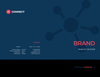
  • 1. BRAND CONTACT Address Connect Company 7th Avenue, Manhattan 578 New York United States Phone | Fax | Online Free Toll: + 1 020 7800 800 Phone: + 1 0800 123 123 Email: info@Connect.com Website: www.Connect.com Visual Brand Guidelines Version 01 | 20-03-2021
  • 2. 2 Introduction The Brand. These guidelines describe the visual and verbal elements that represent Connect corporate identity. This includes our name, logo and other elements such as color, type and graphics. Sending a consistent and controlled message of who we are is essential to presenting a strong, unified image of our company. These guidelines reflect Connect´s commitment to quality, consitency and style. The Connect brand, including the logo, name, colors and identifying elements, are valuable company assets. Each of us is responsible for protecting the company’s interests by preventing unauthorized or incorrect use of the Connect name and marks. Visual Brand Guidelines
  • 3. 3 Table of contents From The President Corporate Logo Corporate Typography Corporate Color Corporate Stationery Logo Placement Corporate Iconography Corporate Photography 04 08 14 20 26 32 36 40 Visual Brand Guidelines
  • 4. 4 From The President We can all be proud of Connect’ accomplishments and confident in the company future: we are positioned to find creative and innovative ways of addressing some of the great challenges facing our world. Our common purpose is to ensure that Connect remains an exceptional place to work. The Company Branding Guidelines help us to develop communications that speak to Connect’ unique mission, characteristics, and spirit. This manual provides clear guidelines so that we can communicate the Connect brand consistently. Ensuring that we adopt these standards across our communications will make a significant contribution to enhancing Connect’ reputation. The work of weaving the Company communications together is ongoing. We can all play a role of thoughtful stewardship when working to communicate Connect’ values and strengths. Maria Kovich Marian P. Kovich President Visual Brand Guidelines
  • 5. 5 Connect Brand Strategy The Connect brand is much more than its seal and wordmark; the brand is reflected in the Company's mission, core values, and strategic themes as communicated through all our messaging and interactions with constituents. The Connect brand as a whole is greater than the sum of its parts. Connect’ strong, recognized brand adds value to the individual companies under the Connect umbrella—a rising tide lifts all boats. In turn, the reputation of the company helps support and validates the equity of the central Connect brand. It’s important to strengthen and reinforce the central brand of Connect, and by association that will strengthen and reinforce the reputation of the companies. This is why, in all our communications, we aim to project a strong, unifying singular voice and appearance. While it may be tempting for companies, departments, and centers at Connect to create their own brand/logo, this would only dilute awareness of the Connect name and create internal competition or, at worst, confusion among our core audiences. Maintaining and strengthening our competitive position requires that all components of the Connect brand appear consistently across all Company communications. No matter which communications channels are used, we all contribute to a unified and professional Connect brand by following the logo, color, and typeface standards in this guide. The new standards were informed by expertise in web, social, print, photography, video, usability, and accessibility for people with visual impairments. The Branding Guidelines are flexible so that each company or unit can communicate its own unique characteristics. Anchored by the Connect logo, you may choose from the official colors and typefaces to define a visual presence that is distinct yet clearly associated with Connect Company as the central primary brand. You may also communicate a distinct brand by using photography, graphic elements, and other visual assets. Visual Brand Guidelines
  • 6. 6 01 | Corporate Logo The Corporate Logo Signage. Our Logo is the key building block of our identity, the primary visual element that identifies us. The signature is a combination of the the symbol itself and our company name – they have a fixed relationship that should never be changed in any way. Visual Brand Guidelines | Corporate Logo
  • 7. 7 The Connect Masterbrand or Corporate Logo comprises two elements, the logo symbol and logo type. The Logo Symbol is a powerful image evoking the culture of design services - the connection between the strength of communication and the different points that influence. It has a particular relationship with the Connect name. The Logo Type has been carefully chosen for its modern and yet refined, highly legible style, which has been further enhanced by the use of upper case letters. The typeface is Montserrat Bold and has also been chosen to compliment and balance perfectly with the logo symbol. The corporate logo is presented through the use of colour as well as shape and form. The two corporate colours are Yellow and Grey. It is a fresh and appealing blend of colours chosen for their strong combination - modern - classic - timeless. The Colours have been selected according to international standards as shown below and are easily implemented. Visual Brand Guidelines | Corporate Logo The Full Logotype 1 1) The Logo Symbol Consists of a powerful element evoking the culture of design services and a red armor backround. 2 2) The Logo Title Carefully chosen for its modern and yet refined, highly legible style, which has been further enhanced by the use of upper case letters in black tone of the chosen corporate color. The font that is used here is Your font Bold. 3) The General Logo The main logo is the dark logo used on white or colored backround. 3 Logo Variants Choosing the right dominant color for your brand is crucial. This color should appear on all your materials, including your logo and packaging.
  • 8. 8 It is important to keep corporate marks clear of any other graphic elements. To regulate this, an exclusion zone has been established around the corporate mark. This exclusion zone indicates the closest any other graphic element or message can be positioned in relation to the mark.of the the symbol itself and our company name – they have a fixed relationship that should never be changed in any way. Logo Construction & Clearspace Visual Brand Guidelines | Corporate Logo x 2x 3x 2x Logo Clearspace The area that surrounds the logo known as “clear space” is as important as the logo itself 1/2x 1/2x 1/2x 1/2x 1/2x 1/2x 1/2x 1/2x
  • 9. 9 A logo lockup refers to the formalized position/relationship of the brand’s logo (symbol) and its wordmark (logotype) Logo Minimum Size Visual Brand Guidelines | Corporate Logo Minimum SIze A logotype refers to words or the name of a business that is designed in a special way. Examples include Pinterest, eBay or Google. 3x 5x
  • 10. 10 Aa Visual Brand Guidelines | Corporate Typography 02 | Corporate Typography The corporate Fonts and typography Typographic hierarchy is another form of visual hierarchy, a sub-hierarchy per se in an overall design project. Typographic hierarchy presents lettering so that the most important words are displayed with the most impact so users can scan text for key information. Typographic hierarchy creates contrast between elements. There are a variety of ways you can create a sense of hierarchy. Here are some of the most common techniques for Connect.Inc layouts.
  • 11. 11 Visual Brand Guidelines | Corporate Typography Brand Typeface Typography plays a crucial role in the design of your brand identity. The typography in your logo can be as impactful as a graphic Fira-Sans Font Fira Sans was designed to be a text face that is pleasant to read on screens. It features a very large x height, slightly condensed letterforms, a mild diagonal stress, sturdy serifs and open forms. There is also Fira Sans Sans, a sans-serif version which closely harmonizes with the weights and styles of this serif family. The Fira Sans project is led by Sorkin Type, a type design foundry based in Western Massachaussets, USA. Montserrat Font Montserrat is a well-balanced contemporary serif with roots in calligraphy. It is a text typeface with moderate contrast well suited for body text. A paragraph set in Montserrat will make a memorable appearance because of its brushed curves in contrast with driving serifs. The overall typographic voice of Montserrat perfectly conveys the mood of a modern-day story, or an art essay. Technically Montserrat is optimised for screen appearance, and works equally well in print.
  • 12. 12 Primary Typeface Visual Brand Guidelines | Corporate Typography Montserrat Font Montserrat Bold ABCDEFGHIJKLNOPQRSTUVWXYZ abcdefghijklnopqrstuvwxyz 1234567890!@£$%^& Montserrat Regular ABCDEFGHIJKLNOPQRSTUVWXYZ abcdefghijklnopqrstuvwxyz 1234567890!@£$%^& ABCDEFGHIJKL NOPQRSTUVWXYZ abcdefghijklnop qrstuvwxyz 1234567890!@£$%^& Styles Regular Regular Italic Bold Bold Italic Montserrat is a free typeface and can be downloaded here: https://fonts.google.com/ specimen/Montserrat
  • 13. 13 Secondary Typeface Visual Brand Guidelines | Corporate Typography Fira-Sans Font Fira Sans Bold ABCDEFGHIJKLNOPQRSTUVWXYZ abcdefghijklnopqrstuvwxyz 1234567890!@£$%^& Fira Sans Light ABCDEFGHIJKLNOPQRSTUVWXYZ abcdefghijklnopqrstuvwxyz 1234567890!@£$%^& ABCDEFGHIJKL NOPQRSTUVWXYZ abcdefghijklnop qrstuvwxyz 1234567890!@£$%^& Styles Regular Regular Italic Bold Bold Italic Fira Sans is a free typeface and can be downloaded here: https://fonts.google.com/ specimen/Fira Sans
  • 14. 14 03 | Corporate Color The Corporate Color Codes. Visual Brand Guidelines | Corporate Color Color plays an important role in the Connect.Inc corporate identity program. The colors below are recommendations for various media. A palette of primary colors has been developed, which comprise the “One Voice” color scheme. Consistent use of these colors will contribute to the cohesive and harmonious look of the Connect.Inc brand identity across all relevant media. Check with your designer or printer when using the corporate colors that they will be always be consistent.
  • 15. 15 Visual Brand Guidelines | Corporate Color The Corporate Color Strategy The corporate color system reflects a rich, dynamic, multi-dimensional Connect. Connect is no longer simply a onedimensional “red” company. We will retain red as the primary corporate color, but only use it in deliberate ways as an accent that elevates it to “special” status; a nod to our history that is reinforced in every communication The system The existing Connect red/Blue corporate palette has been expanded to include the use of both dynamic and neutral colors that complement each other and can be used in any combination as long as the integrity of the brand is not diminished. Amaranth Catalina Blue Jelly Bean Charlotte Panache
  • 16. 16 Primary Colors Explanation: The Connect.Inc Company has Two official colors: Red and Blue. These colors have become a recognizable identifier for the company. Usage: Use them as the dominant color palette for all internal and external visual presentations of the company. HEX RGB HSV CMYK #e63946 230 57 70 355 75 90 0 75 70 10 HEX RGB HSV CMYK #1d3557 29 53 87 215 67 34 67 39 0 66 Almost 90% of people’s assessment on products or services is based on colors alone. Due to colors’ strong influence on moods and feelings, their association with products can influence our attitudes and affect purchasing power towards brands. Visual Brand Guidelines | Corporate Color
  • 17. 17 Secondary Colors Explanation: The Secondary colors are complementary to our official colors, but are not recognizable identifiers for our company. Secondary colors should be used sparingly (less than 10 % of the palette in one piece. Usage: Use them to accent and support the primary color palette. HEX RGB HSV CMYK #457b9d 69 123 157 203 56 62 56 22 0 38 HEX RGB HSV CMYK #a8dadc 168 218 220 182 24 86 24 1 0 14 HEX RGB HSV CMYK #f1faee 241 250 238 105 5 98 4 0 5 2 Color palette choices are used to differentiate items, create depth, add emphasis, and help organize information Visual Brand Guidelines | Corporate Color
  • 18. 18 The Company Letterhead Visual Brand Guidelines | Corporate Stationery x x x X 3X 3X x 2X FRONT DESIGN BACK DESIGN Size : 210mm (w) x 297mm (h) Paper : Impact Lenza 130 gsm 100% Printing : 4 col. offset front printing Front side Logo size : 12mm (h) Safe space = height of the logo (12 mm) from all 4 sides Position : Top right (top right aligned to the letterhead) Office address : 10pt Fira Sans Regular dark grey Height of the identity bar = 6mm * Specifications for continuation sheet is the same, except that there will be no address on it. restricted area for logotype including the the safe space Connect.Inc Company 7th Avenue, Manhattan 578, New York, United States E: info@design-inc.com P: +01.132.4567.890 x x 1/2x
  • 19. 19 The Company Envelope Visual Brand Guidelines | Corporate Stationery Size : 235mm (w) x 108mm (h) / 9.25”(w) X 4.25” (h) Paper : Impact Lenza 130 gsm 100% Printing : 4 col. offset front printing Front side Logo size : 9mm (h) Safe space = height of the logo (9 mm) from all 4 sides Position : Top left (top right aligned to the envelop) Office address : Company Name in 9pt Fira Sans Bold with 18pt line spacing. Addresses in 9pt Fira Sans Regular with 15pt line spacing in dark grey (70%) 9pt Fira Sans Regular dark grey (70%) Height of the identity bar = 4.5mm FRONT DESIGN BACK DESIGN x x x x restricted area for logotype including the the safe space
  • 20. 20 The Company Business Card Visual Brand Guidelines | Corporate Stationery Size : 90mm (w) x 50mm (h) Paper : Impact Lenza 300 gsm 100% recycled Printing : 4 col. digital front and back printing Finish : Both side Aqueous coat overprint Front side Background : C100, M20, Y0, K0 Logo size : 6mm (h) Safe space = height of the logo (6 mm) Position : Top right Individual’s information Position : Bottom left (3mm margin from left) Font : Fira Sans Name of the person : 8pt (Bold) Designation : 7pt (Regular) Gray Contact numbers : 7pt (Regular) Gray E-Mail : 7pt (Regular) White Office address : 6pt (Regular) White Height of the identity bar = 3mm x x x x restricted area for logotype including the the safe space FRONT DESIGN BACK DESIGN X 2X Connect.Inc Company 7th Avenue, Manhattan 578, New York, United States E: info@design-inc.com P: +01.132.4567.890 x x x 1/2x Name of the Person Designation Contact number (country 1) Contact number (country 2) Email.Address@kpit.com
  • 21. 21 The Company Email Signature Visual Brand Guidelines | Corporate Stationery Mark David / Business Developemnt mdavid@Connect.com / 305-999-9999 Connect, lnc www.Connect.com Fira Sans Bold , 12pt Fira Sans Regualr , 12pt Fira Sans Regualr , 12pt LOGO Name / Position Email / Phone Number Company Name Website Name in 10pt Segeo UI bold in Dark Grey Body Text in 9pt Segeo UI regular in Dark Grey URL and Social media links in Dark Grey - 9pt “Connect” in 12pt Bold in Connect Red Any partner logo / Award logo should appear in the next time after the social media links In no case should the Connect logo be used as part of the email signature Please do not COPY the signature directly from here (given on the right hand side of this page). Kindly head to https://Connect.com and look for the file titled, "Corporate email signature.docx". This file also carries the format you can copy and the instructions on how you can create your own email signature in the given format.
  • 22. 22 05 | Logo Placement The correct Logo Placement Whenever possible, the Connect logo should be placed in the upper right corner of the webpage/page in full color, on a white background. Logo placement helps build Linexor brand awareness. On printed material like a letterhead, a business card or an envelope, double the distance of the letters “ou” around the edge. We have created two examples that illustrate this concept. Print In print applications, “initial view” refers to the cover of materials with multiple pages or the front of one-sided materials. For two-sided materials, the logo can appear on either side depending on design. Email For HTML emails such as department newsletters, the logo must appear somewhere within the message. It does not need to be in the header. Website The logo must appear before any user interaction (click, scroll, input, etc.). Visual Brand Guidelines | Logo Placement
  • 23. 23 Visual Brand Guidelines | Logo Placement The Right Place For Logo To place the Connect.Inc logo in the correct way please use one of the approved styles that are shown on the right. To place the Connect.Inc logo in other ways is not allowed. Spacing for Primary Placement 0.3x x Spacing for secondary Placement 0.3x x x 2x x x restricted area for logotype including the the safe space 8.5x11 in x x x x restricted area for logotype including the the safe space 8.5x11 in
  • 24. 24 06 | Corporate Iconography Corporate Iconography System Icons are graphics that take up a small amount of space and provide a quick, intuitive representation of an action, status, or functionality. In order to ensure that icons retain their ability to communicate clearly and succinctly,it’s important not to dilute the system by creating new versions or variations of the existing icon set. Icons are: • Helpful in adding visual interest and making a page more scannable. • More and more commonplace as screens get smaller and real estate is increasingly scarce. Icons are not: • Wholesale replacements for text. • Appropriate for enlargement and use as illustrations. • Used for more than one defined representation. Visual Brand Guidelines | Corporate Iconography
  • 25. 25 Visual Brand Guidelines | Corporate Iconography Connect Icons Wherever possible icons should be created in a flat icon style using Connect Cool Grey (Pantone 3c) paired with one other Connect colour. An icon is a pictogram displayed on a screen or print layout in order to help the user navigate through the content in a easier way. The icon itself is a small picture or symbol serving as a quick, “intuitive” representation of a software tool, function or a data file. Examples for Connect.inc Corporate iconography System - How to: - only use icon with a backround - minimum stroke size: 0.5 pt - upscale only proportional Podcast Global Filter Calendar Tag Recruit Popular Secure Area Audiences REPRESENTATIONAL Icons are graphics that take up a small amount of space and provide a quick, intuitive representation of an action, status, or functionality. Connect Search Email Audio ACTION - ORIENTED Icons are graphics that take up a small amount of space and provide a quick. Previous Next Close Accordian Open Accordian Menu Close More Enlarge WAYFINDING Icons are graphics that take up a small amount of space and provide a quick, intuitive representation of an action, status, or functionality.
  • 26. 26 Visual Brand Guidelines | Corporate Photography 07 | Corporate Photography Corporate Images and Blending Modes. Corporate Images are responsible to transfer the values of Design.Inc to our customers or our potential customers. It is a composite psychological impression that continually changes with the firm’s circumstances, media coverage, performance, pronouncements, etc. Connect.Inc use various corporate advertising techniques to enhance their public image in order to improve their desirability as a supplier, employer, customer, borrower, partner, etc. Photography Photography and illustrations are powerful and emotive tools that express our values just as strongly as colours and typefaces. These guidelines should help you think about images, but they cannot cover every decision you have to make. You need to use your judgment and discretion. In particular, avoid clipart or any other prefabricated images from the internet. These suggest a lack of effort and imagination, and can risk looking like a crude ‘cut and paste’, rather than careful selection. The quality of such images, like that of other illustrations, can also be hard to control.
  • 27. 27 Visual Brand Guidelines | Corporate Photography
  • 28. www.Connect.com CONTACT Address Connect Company 7th Avenue, Manhattan 578 New York United States Phone | Fax | Online Free Toll: + 1 020 7800 800 Phone: + 1 0800 123 123 Email: info@Connect.com Website: www.Connect.com